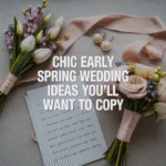
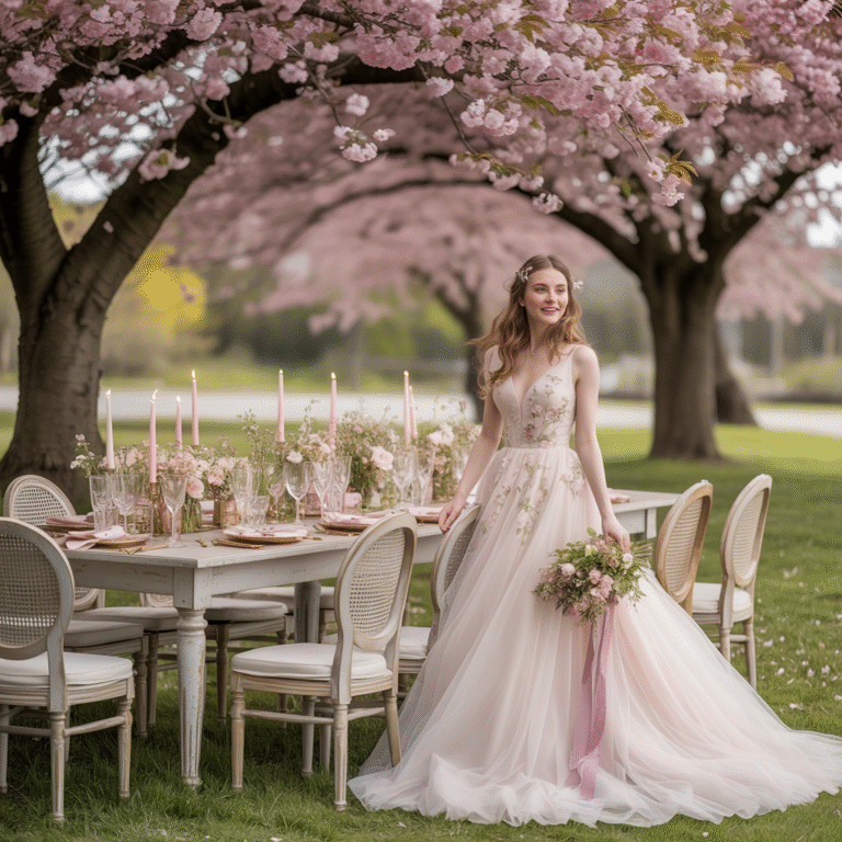
Spring weddings? Absolute magic. Soft blooms, warm breezes, and that feeling like everything’s waking up again—kind of perfect for starting forever with your person. But let’s be honest: the usual pastel suspects (hi, blush and sage) have had their moment. So what if you want something a little more you and a little less Pinterest déjà vu?
Let’s talk modern spring wedding color palettes—the kind you haven’t seen at every wedding since 2016. I’ve rounded up my favorite fresh, unexpected combinations that are trending hard for 2025, and spoiler alert: they’re stunning.
Whether you’re planning your own big day or helping a friend nail down a palette that doesn’t feel like a repeat, these combos offer a breath of fresh (and stylish) air.
1. Lilac, Copper & Soft Stone
This is for the bride who loves soft romance but isn’t afraid of a little edge.
Why it works:
- Lilac adds that airy, floral softness.
- Copper brings in warmth and modern contrast.
- Stone grey grounds everything with an elegant, minimal base.
It’s a combo that’s quietly cool—like if your wedding had a fragrance, it would be woodsy florals with a hint of spice.
2. Olive, Buttercream & Dusty Blue
This palette screams countryside elegance (in a good way).
The vibe:
- Olive: Earthy and rich without being overpowering.
- Buttercream: Soft, warm, and deliciously creamy (obviously).
- Dusty blue: That perfect hint of airiness.
Use it for garden weddings, vineyard ceremonies, or anywhere that has a rustic backdrop. Add in wildflowers and loose greenery for maximum aesthetic.
3. Terracotta, Soft Peach & Sky
Ever wanted to bottle a sunset? This comes close.
Why it pops:
- Terracotta adds warmth and depth.
- Soft peach keeps it sweet.
- Sky blue introduces a playful freshness.
It’s like a desert wedding’s softer cousin—boho with a bit more lightness.
4. Moss, Mauve & Cream
This one feels like a secret garden—but make it editorial.
Color breakdown:
- Moss: Rich, grounded, and unexpected.
- Mauve: Understated floral glam.
- Cream: Always classic, always balancing.
If you love botanical elements, this combo gives you all the natural beauty without leaning too dark or moody.
Add in textured linens, vintage brass candle holders, and layered blooms for depth.
5. Apricot, Sage & Porcelain White
A modern twist on neutrals that feels fresh without trying too hard.
Here’s the secret:
- Apricot: Think less orange, more soft golden glow.
- Sage: Still trending, still lovely.
- Porcelain white: Crisp and clean, not clinical.
The best part? This palette looks amazing in both outdoor and indoor settings. You can’t go wrong.
6. Lavender, Ochre & Midnight
You didn’t expect that, did you?
Bold yet balanced:
- Lavender brings the floral softness.
- Ochre adds contrast and depth.
- Midnight blue makes everything pop and feels expensive.
This one’s for the cool, creative couples who want something completely different but still elegant. Add calligraphy with black ink on textured paper for that artsy finish.
7. Coral, Pistachio & Cloud Grey
Fun fact: this combo is super underrated.
Why we love it:
- Coral is playful and bold.
- Pistachio is that unexpected cool tone that balances it.
- Cloud grey keeps things soft and sophisticated.
This one’s low-key playful without ever getting cheesy. Use it for modern, colorful weddings that don’t feel like a kid’s birthday party.
8. Wisteria, Soft Gold & Glacier
This combo is giving fairytale—but elevated.
Breakdown:
- Wisteria: That delicate violet hue that screams romance.
- Soft gold: Just the right amount of luxe.
- Glacier blue: A cool tone that keeps it fresh.
Use it with chiffon fabrics, soft lighting, and metallic details. Think candlelight on white stone, strings of soft blue fairy lights, and flowing gowns.
Trust me, it’s ethereal in all the right ways.
9. Lemon, Dusty Rose & Clay
Yes, you read that right—lemon.
Surprisingly chic:
- Lemon yellow adds brightness.
- Dusty rose softens it with a romantic edge.
- Clay grounds it and keeps things grown-up.
Perfect for outdoor brunch weddings or retro-inspired events. Don’t overdo the yellow—let it pop through florals or glassware.
10. Mint, Blush Terracotta & Cream Linen
Okay, so this is one I saw at a micro wedding last spring, and it’s haunted my mood board ever since.
Details to love:
- Mint adds freshness.
- Blush terracotta is a warm, rosy take on the earth tone.
- Cream linen brings everything together.
It’s soft, earthy, romantic—and way more interesting than just “blush and greenery.”
How to Choose the Right Palette (Without Losing Your Mind)
Look, choosing your wedding colors shouldn’t feel like a crisis of identity. Here’s how to stay sane while still slaying your spring aesthetic:
1. Start with the vibe, not the colors.
Ask yourself: What’s the feeling of your wedding? Cozy garden party? Modern and edgy? Minimalist with a hint of whimsy? Choose colors that match that mood.
2. Use your venue as a guide.
If your ceremony’s in a botanical garden, moss and lavender work better than dark navy and gold. Let the space lead the design.
3. Choose 2–3 main tones, then layer neutrals.
Don’t try to cram 8 shades into one event. It’s a wedding, not a box of crayons.
4. Test your palette in natural light.
What looks chic online can look super off in real life. Make a mini mood board or table mock-up and photograph it in daylight.
Final Thoughts: Go With What You Love
Trends are cute, but what’s cuter? A couple that chooses colors they genuinely love. If one of these palettes speaks to your soul, go with it. If not, mix and match until something feels right.
Just remember: this day is yours. Whether you go full desert-glam or soft romantic garden, the most important thing is that your colors feel like you.
Also—your photos will live forever. So maybe don’t choose neon green. Just sayin’. 🙂