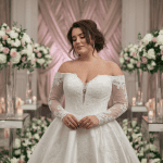
Some color combos just work. Like PB&J, rosé and summer, or black leggings with oversized sweaters. For weddings, burnt orange and burgundy are that power duo. They’re warm, bold, and ridiculously photogenic—basically the ultimate palette for anyone who wants their wedding to feel both trendy and timeless.
The best part? These shades look good anywhere: rustic barns, modern lofts, vineyard estates, you name it. Whether you’re going for cozy fall vibes or elevated glam, burnt orange and burgundy wedding details instantly set the mood. Let’s talk about how to work this palette into your big day without making it look like you robbed the pumpkin patch.
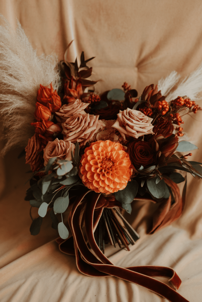
1. Bold Bouquets
Florals are the easiest way to flex burnt orange and burgundy. Mix dahlias, garden roses, and ranunculus for depth, then add eucalyptus or pampas grass for texture. The result? A bouquet that makes you feel like a queen every time you look down.
Styling tip: Wrap the stems in velvet ribbon to nail that luxe vibe.
Why couples love it: It’s lush, vibrant, and photographs like a dream.
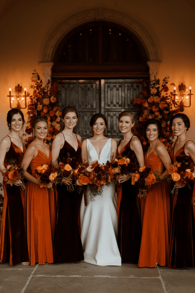
2. Bridesmaid Dresses in Chic Contrasts
Forget the matchy-matchy bridesmaid look. Alternate dresses in burnt orange and burgundy for a modern, editorial feel. The contrast is bold, but the tones are harmonious enough to look cohesive.
Styling tip: Let each bridesmaid pick their silhouette within the palette so everyone feels comfy.
Why it works: It looks stylish, fresh, and flatters every skin tone.
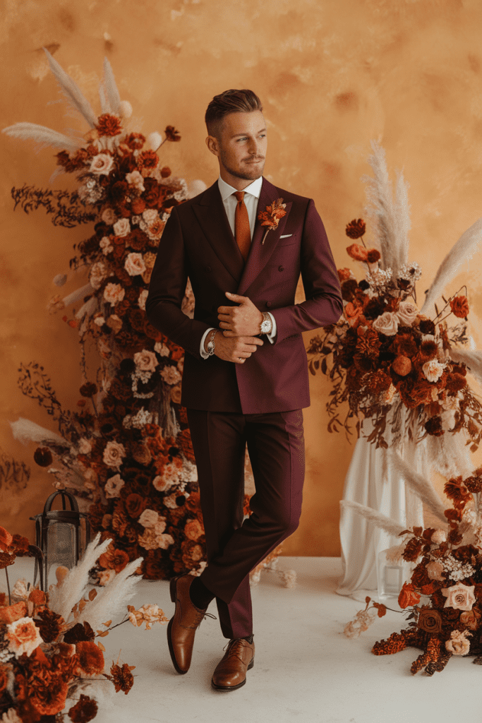
3. Burgundy Suits or Burnt Orange Accents for the Groom
Not into the classic black tux? Burgundy suits are sleek, fashion-forward, and less expected. If full color feels like too much, add burnt orange touches with a tie, pocket square, or boutonniere.
Styling tip: Pair with brown leather shoes to keep it grounded.
Why couples swoon: It’s modern, confident, and looks killer in photos.
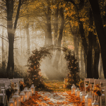
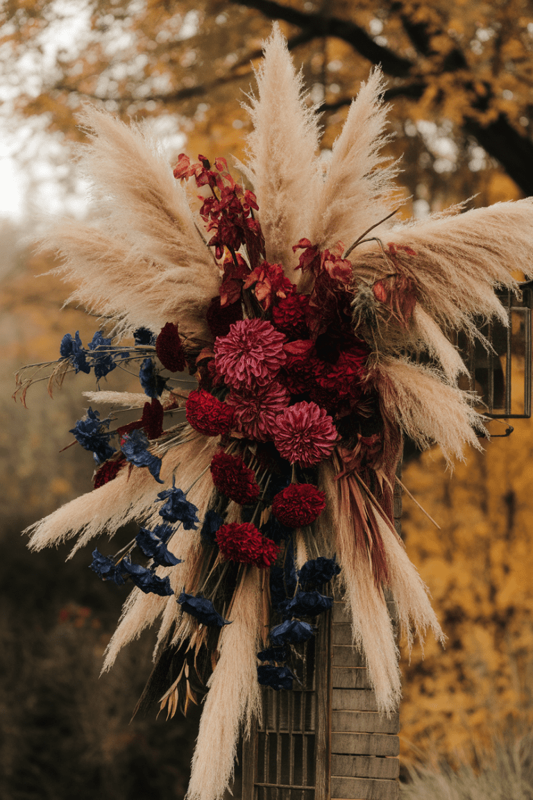
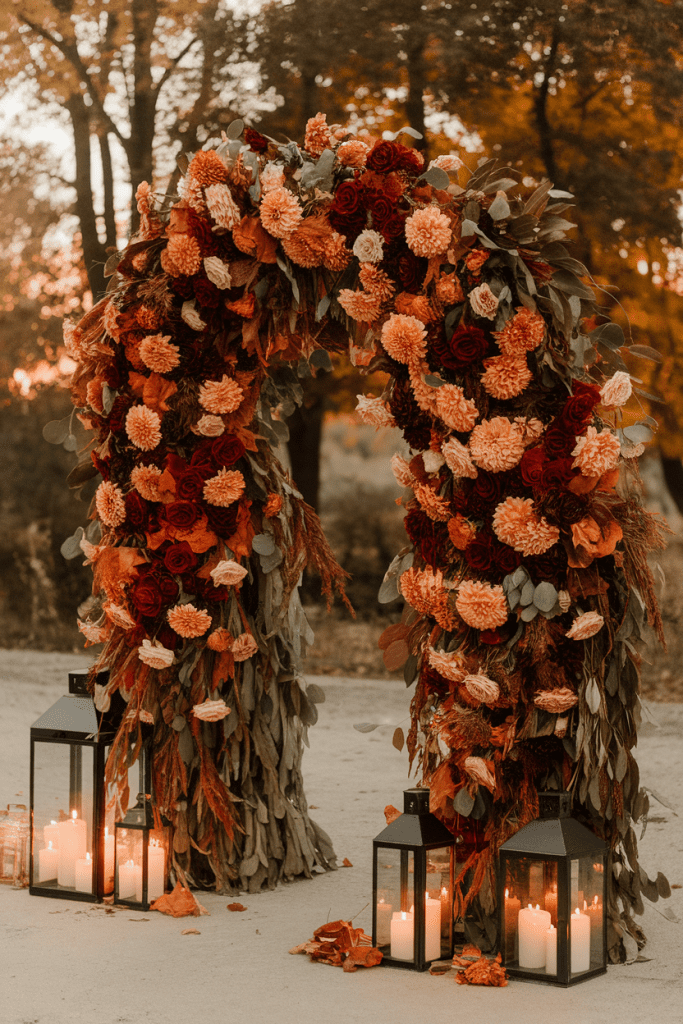
4. Ceremony Arches That Pop
Picture this: an arch dripping with burgundy roses, burnt orange dahlias, and fall foliage. It’s bold enough to stand on its own, so you don’t have to overspend on other ceremony décor.
Styling tip: Frame it with candles or lanterns to amp up the romantic mood.
Why it’s loved: It makes your “I do” moment look straight out of a magazine.
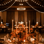
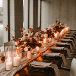
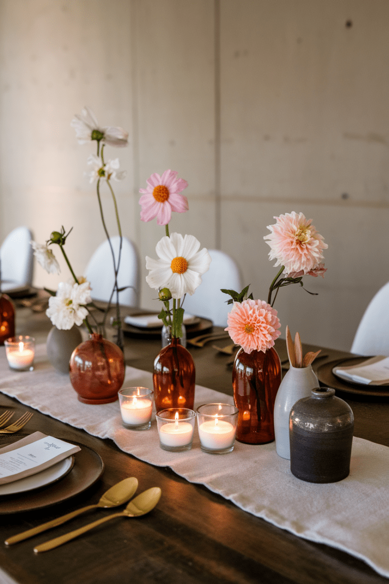
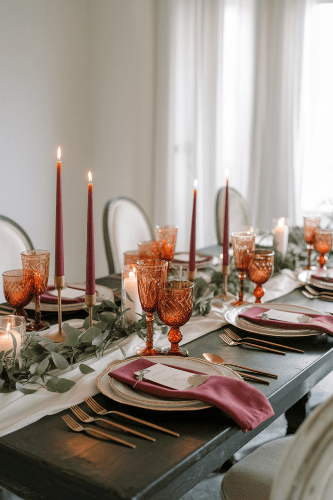
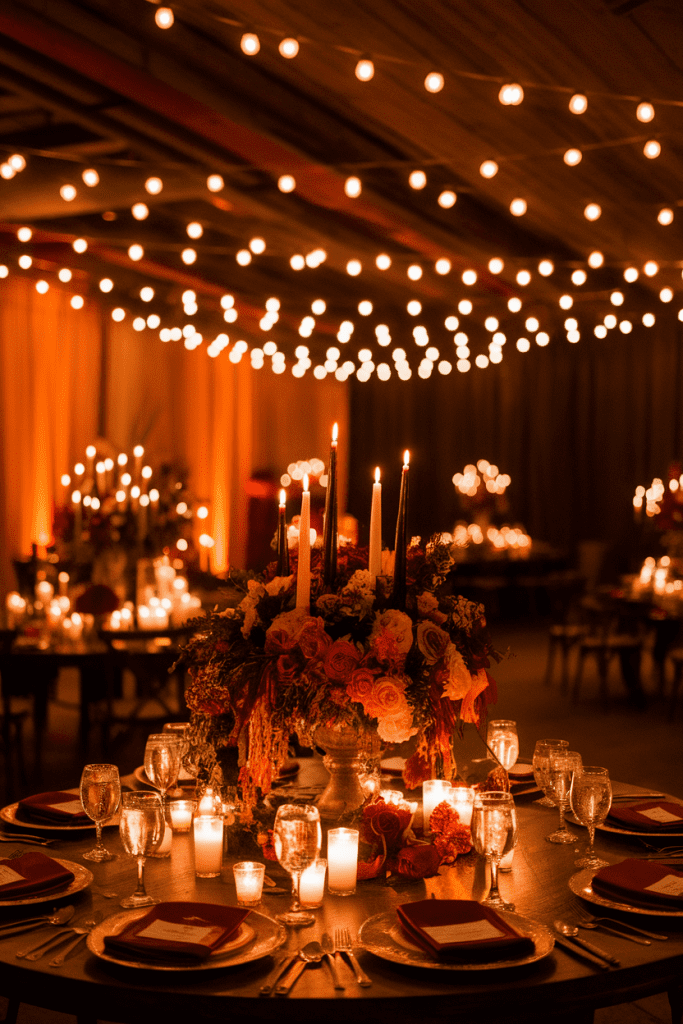
5. Luxe Tablescapes
Tables are where your palette really shines. Burgundy napkins, burnt orange glassware, and gold flatware create a luxe look without going overboard. Add greenery runners or low floral arrangements for depth.
Styling tip: Stick to ivory or taupe linens as a neutral backdrop.
Why it works: It feels warm, stylish, and elevated without being fussy.
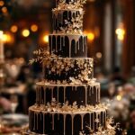
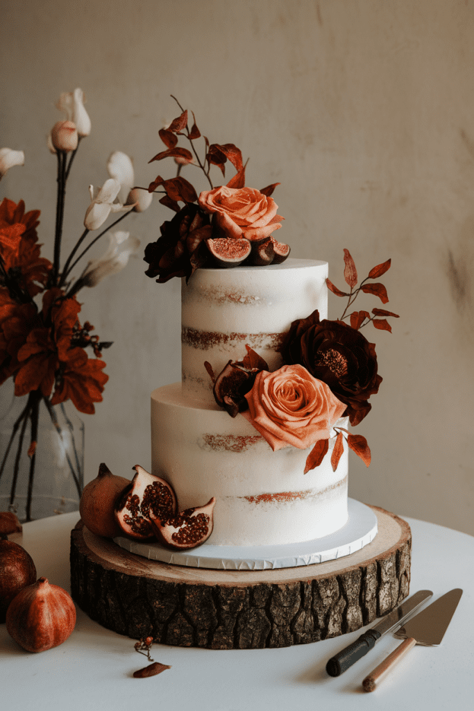
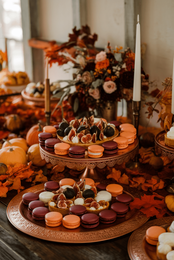
6. Cakes with Warm Hues
Minimalist white cakes are classic, but adding burnt orange and burgundy accents—like sugar flowers, brushstroke details, or ombré layers—takes it to another level.
Styling tip: Display your cake with fall fruits (like figs or pomegranates) for that editorial touch.
Why couples love it: It doubles as dessert and décor.
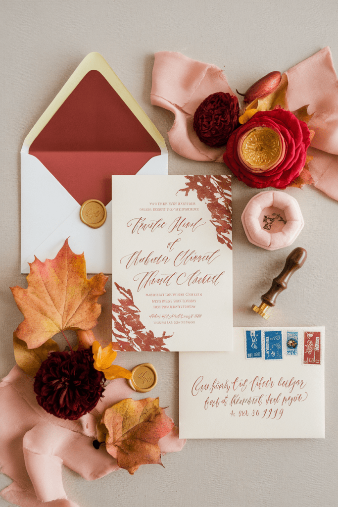
7. Invitation Suites with Bold Pops
Your invites set the tone, so lean into the palette early. Think cream cardstock with burgundy calligraphy, or terracotta envelopes with gold wax seals. Guests will know they’re in for a stylish event.
Styling tip: Use textured paper for an artisanal vibe.
Why it’s loved: It feels luxe and personalized.
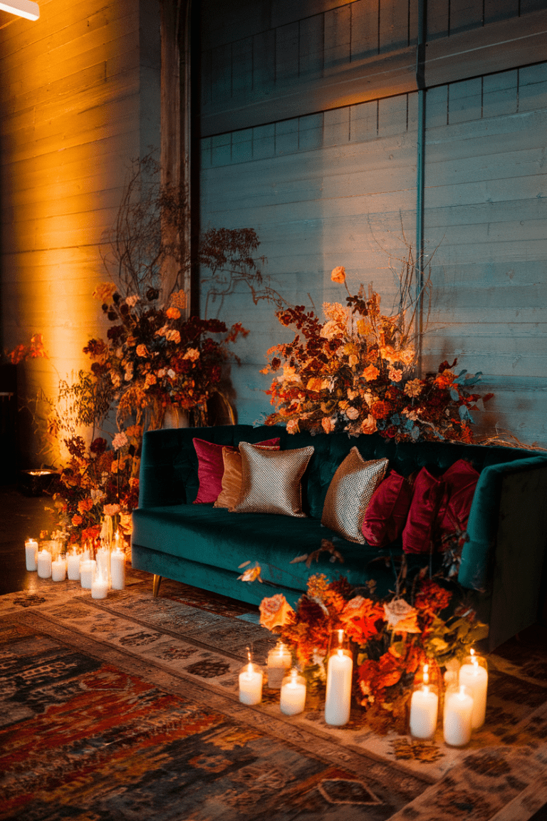
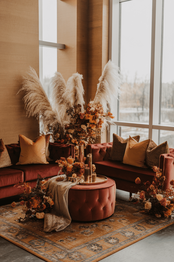
8. Lounge Corners with Cozy Textures
Create cozy lounge areas with velvet sofas in burgundy or burnt orange, plus pillows and throws in complementary shades. It gives guests a stylish hangout space for cocktails or late-night chats.
Styling tip: Layer rugs and mismatched chairs to make it feel curated.
Why people love it: It’s both practical and ridiculously Instagrammable.
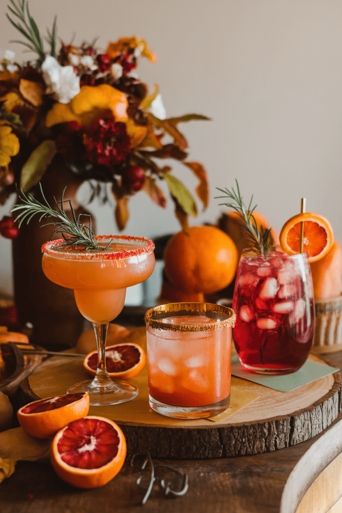
9. Signature Cocktails in the Palette
Yes, your drinks can match your color scheme. Serve blood orange margaritas or pomegranate spritzes for burgundy vibes. Add copper mugs or gold-rimmed glasses for extra glam.
Styling tip: A cinnamon or rosemary garnish makes them look as good as they taste.
Why it’s a hit: Guests get a stylish sip and another photo op.
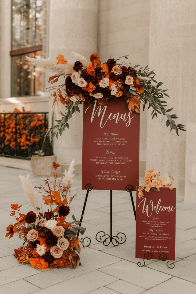
10. Stationery and Signage
From menus to welcome signs, incorporate your palette into print pieces. Burgundy ink on burnt orange backgrounds (or vice versa) creates a sleek, cohesive look.
Styling tip: Keep fonts clean and modern so the bold colors shine.
Why couples love it: It ties the whole wedding aesthetic together seamlessly.
11. Romantic Lighting
Warm lighting keeps this bold palette from feeling too heavy. Edison bulbs, amber uplighting, or hundreds of tiny candles make everything glow. Bonus: burgundy and burnt orange tones pop under warm light.
Styling tip: Skip cool-toned LEDs unless you want your palette to look neon.
Why it works: It’s moody, romantic, and flattering for everyone.
12. Seasonal Desserts and Details
Carry the palette into desserts and small details—like burgundy macarons, burnt orange macarons, or even mini pumpkin tarts with berry garnishes. Little touches like these keep the theme cohesive without being in-your-face.
Styling tip: Display desserts on copper trays or wooden boards for texture.
Why it’s loved: It’s thoughtful, seasonal, and delicious.
Conclusion: A Palette That Never Misses
Burnt orange and burgundy aren’t just fall staples—they’re forever chic. They balance warmth and drama, making every photo feel rich and timeless. Whether you go big with floral arches or subtle with cocktails and stationery, this palette works across every detail.
At the end of the day, burnt orange and burgundy weddings feel stylish, cozy, and effortlessly elegant. And honestly? It’s one of those color combos that makes your big day look like it belongs in a wedding magazine—without trying too hard.