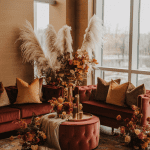
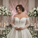
Autumn weddings have always been that sweet spot where cozy meets dramatic. The crisp air, the fiery leaves, the smell of spiced cider—it’s like nature is literally begging you to throw the most stylish party of your life. But here’s the twist: 2025 isn’t about pumpkin-orange everything. The color palettes hitting weddings this year are moodier, more layered, and surprisingly versatile.
Think rust paired with icy blue (yes, it works), or deep plum next to blush neutrals. It’s about mixing earthy warmth with unexpected tones that pop in photos and make your wedding look expensive (even if you DIY half the décor).
So, whether you’re planning your big day or just love stalking color palettes like it’s your job, here are the 12 best autumn colors ideas for 2025. Each one feels modern, chic, and—most importantly—like you could actually pull it off without losing your sanity.
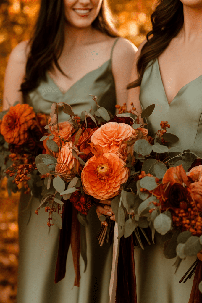
1. Burnt Orange and Sage Green
This combo is peak autumn vibes. Burnt orange brings the warmth, while sage green keeps it grounded and fresh. Together, they’re like pumpkin spice but make it fashion.
Style tip: Use burnt orange in your florals (dahlias, ranunculus) and sage for bridesmaid dresses or table linens. It balances drama with calm.
Why couples love it? It’s timeless, earthy, and looks insane against an outdoor fall backdrop.
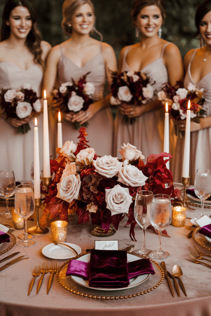
2. Plum and Blush Neutrals
Dark plum is basically the wine-stained lipstick of wedding palettes. Pair it with soft blush and taupe neutrals, and suddenly the vibe is romantic but not too heavy.
Style hack: Make plum the accent (like velvet napkins or groomsmen ties) and let blush handle the bulk in florals.
Why it works? It’s moody but approachable, and it photographs like a dream under candlelight.
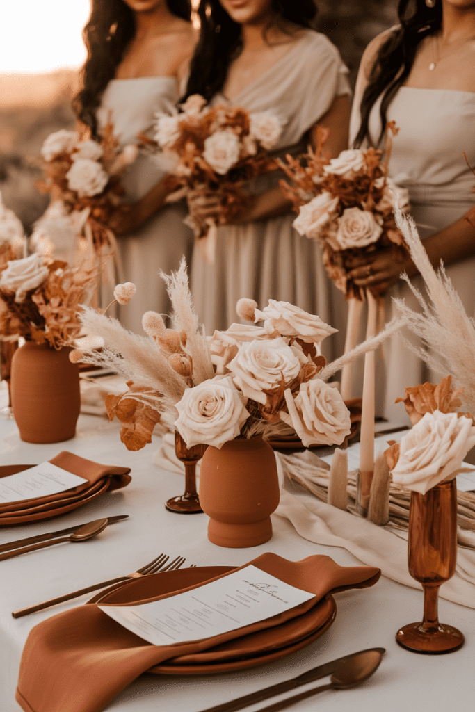
3. Terracotta and Cream
Terracotta is that color that just won’t quit—and thank goodness, because it’s flattering on literally everything. Paired with cream, it’s a softer take on rustic fall.
Pro move: Use terracotta in ceramics and tableware, while cream dominates florals and dresses.
Why couples love it? It feels earthy yet modern, perfect for boho-meets-editorial weddings.
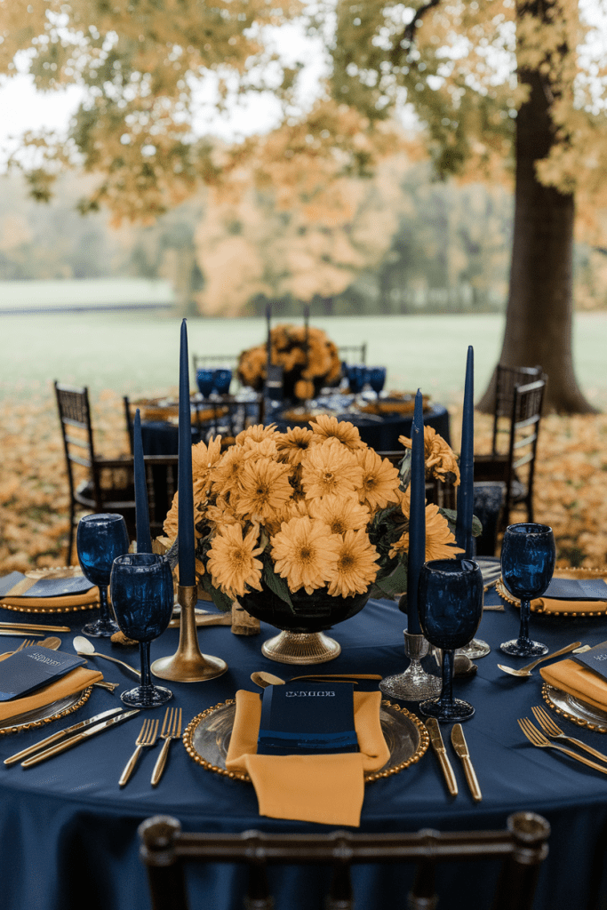
4. Navy and Mustard
Unexpected? Yes. Chic? Absolutely. Navy gives depth, while mustard yellow adds energy and playfulness without feeling too springy.
Style hack: Navy suits for the guys, mustard florals for the girls—it’s balanced and bold.
Why it works? It’s daring but sophisticated, especially for couples who don’t want “just another fall palette.”
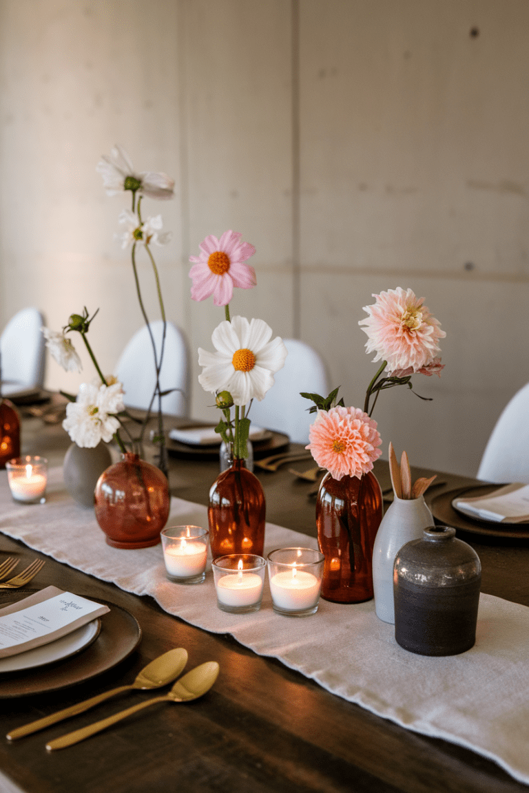
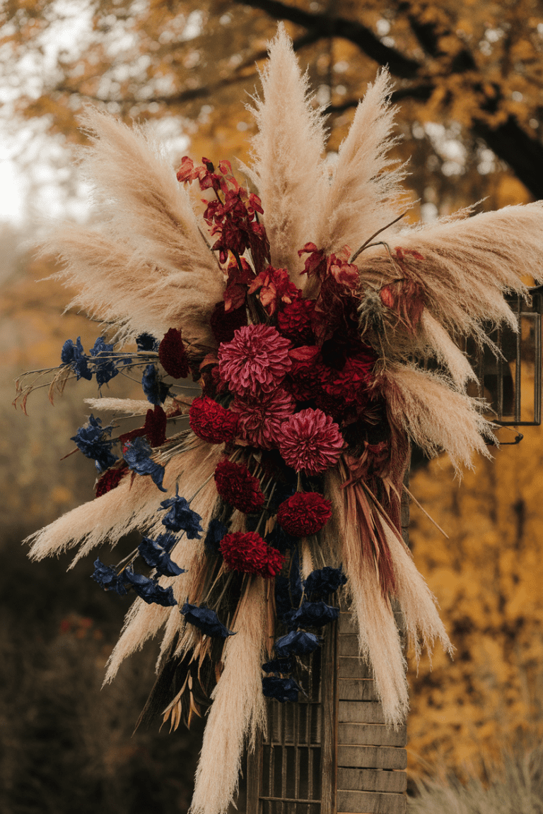
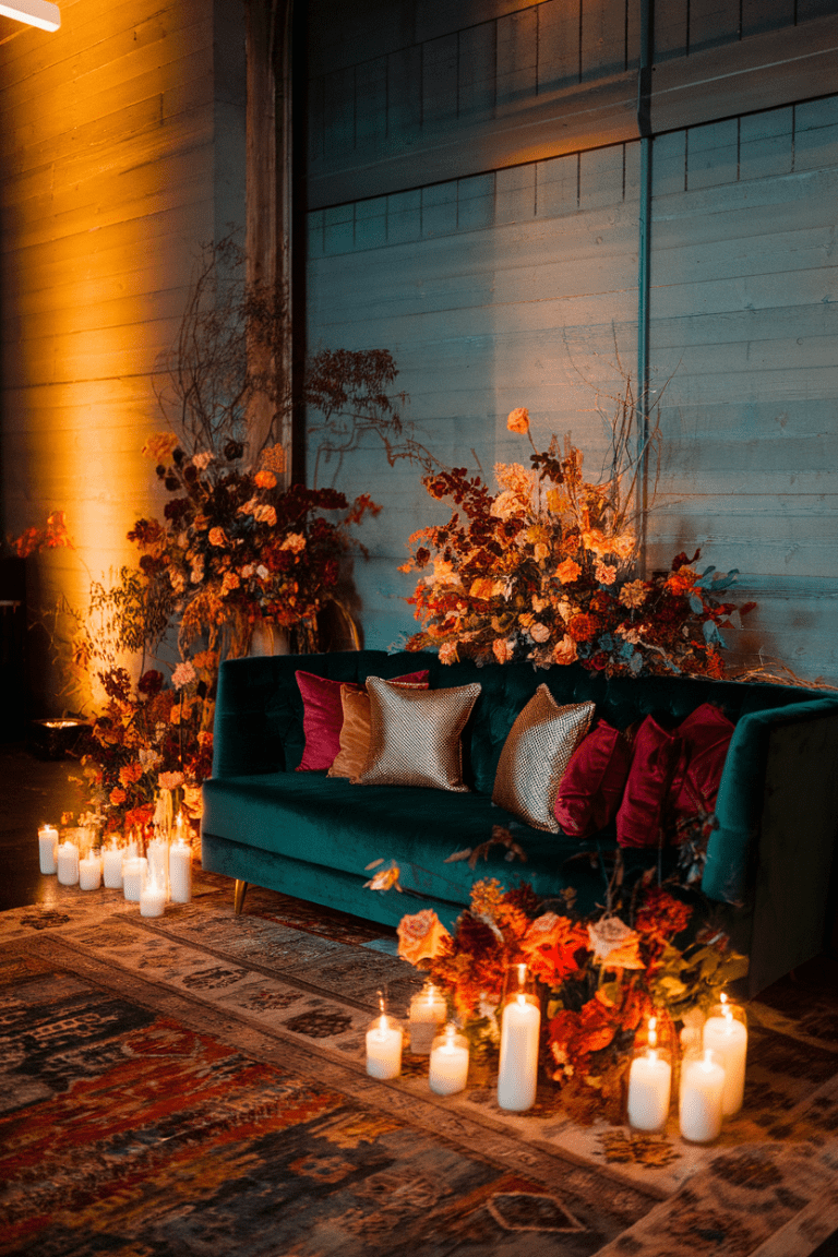
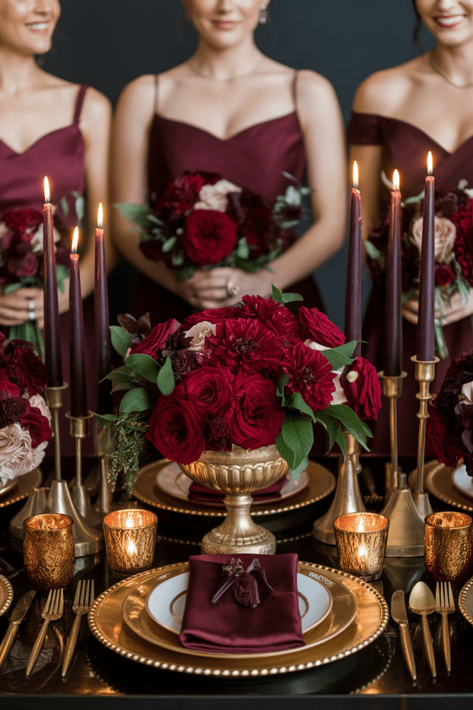
5. Burgundy and Gold
You knew this one was coming. It’s classic for a reason. Burgundy screams richness, and gold adds the luxe touch. Together, they’re old-money chic without trying too hard.
Style tip: Go heavy on the gold flatware and candleholders—burgundy flowers will do the rest.
Why couples love it? It feels regal, timeless, and indulgent in all the right ways.
6. Olive Green and Dusty Rose
This palette is like your effortlessly stylish friend who always wears neutrals but somehow looks cooler than everyone else. Olive keeps things earthy, while dusty rose softens the mood.
Pro move: Use olive in foliage-heavy arrangements and dusty rose in bridesmaid dresses.
Why it works? Subtle, chic, and low-maintenance without being boring.
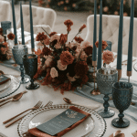
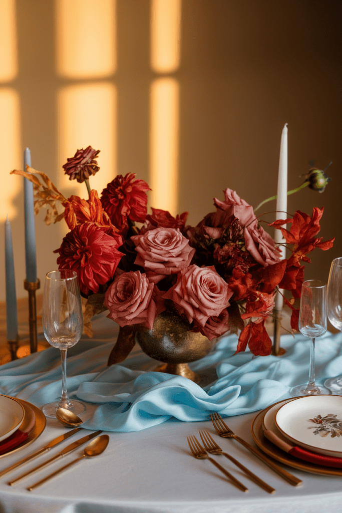
7. Rust and Icy Blue
Okay, hear me out: warm rust tones paired with cool icy blue is the unexpected mashup 2025 didn’t know it needed. The contrast feels modern and editorial.
Style hack: Think rust-toned florals with icy blue silk ribbons or table runners.
Why couples love it? It’s fresh, striking, and perfect for couples who like to bend the rules.
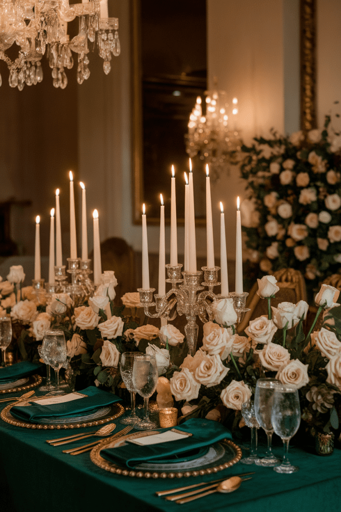
8. Emerald and Champagne
Emerald green is basically the Beyoncé of wedding colors—commanding, chic, and impossible to ignore. Paired with champagne, it feels luxe but not overpowering.
Style hack: Emerald bridesmaid gowns with champagne florals = chef’s kiss.
Why it works? High-contrast elegance that photographs like couture.
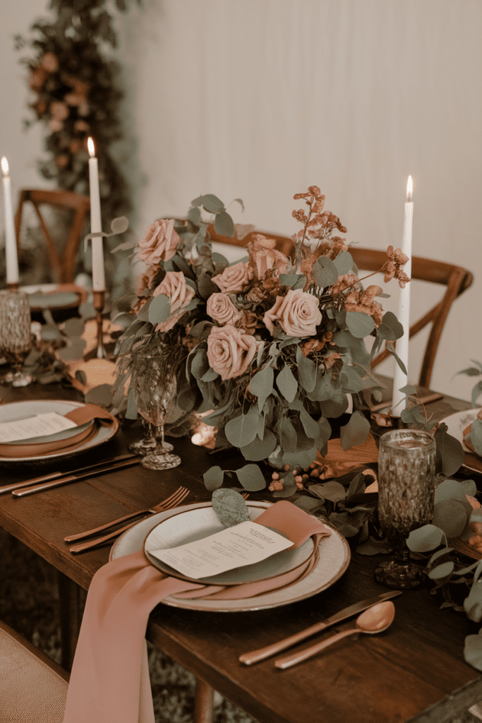
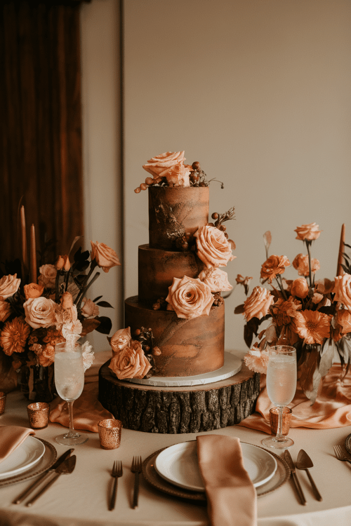
9. Mocha Brown and Peach
This combo is soft, warm, and cozy without being basic. Mocha grounds the palette, while peach brings in a hint of sweetness.
Tip: Use mocha in table linens or stationery, and peach in florals or cake details.
Why couples love it? It’s approachable, modern, and surprisingly versatile.
10. Charcoal Gray and Copper
Charcoal is the cool older cousin of black—it’s softer but still moody. Add copper, and suddenly you’ve got industrial-meets-romantic.
Pro move: Use charcoal in stationery and tablecloths, and let copper shine in vessels and candles.
Why it works? It’s edgy, modern, and guaranteed to stand out.

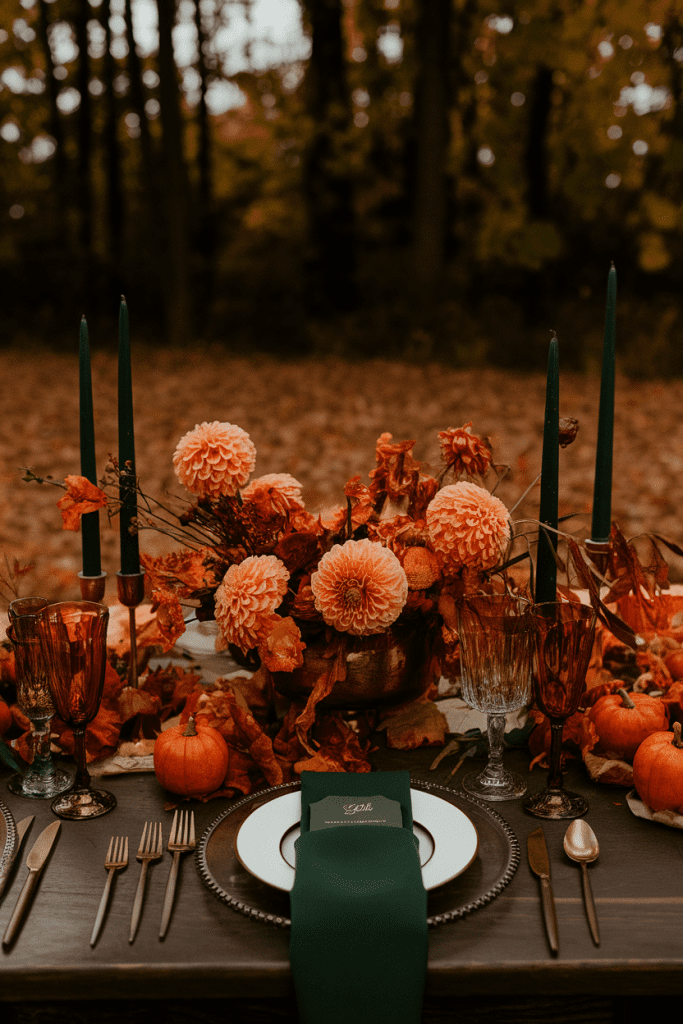
11. Forest Green and Burnished Orange
Forest green is that deep, grounding tone that looks amazing in outdoor weddings. Paired with burnished orange, it feels bold, natural, and seasonally perfect.
Tip: Think forest green suits or linens with orange accents in florals.
Why couples love it? Because it’s fall personified—strong, rich, and vibrant.
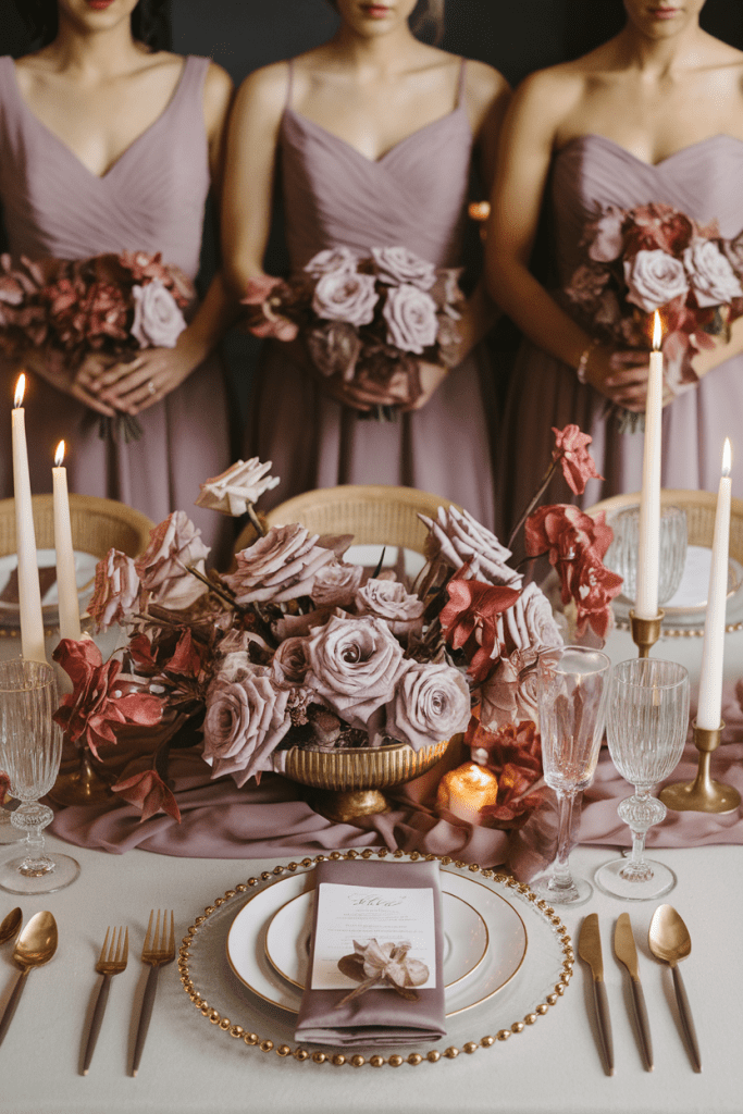
12. Champagne and Mauve
Want romance without the heaviness? Champagne and mauve bring softness, shimmer, and that editorial vibe you see on Pinterest boards.
Style hack: Add gold accents to keep it luxe, not washed out.
Why it works? It’s romantic, timeless, and ridiculously photogenic.
Conclusion
The best autumn wedding colors in 2025 aren’t about sticking to predictable pumpkin spice tones. They’re about unexpected pairings, luxe textures, and palettes that feel personal yet editorial. Whether you’re drawn to moody jewel tones, earthy neutrals, or daring contrasts, the trick is to layer your colors across florals, linens, attire, and décor so it feels intentional—not like you just picked napkin shades at random.
And remember: your photos will last longer than your centerpieces or your cake. Pick a palette that not only looks stunning in person but also photographs beautifully under candlelight, golden hour, and yes—even iPhone flash. Because if your wedding colors make your guests say “wow” IRL and double-tap on Instagram, you’ve officially nailed it.