Some moments deserve more than flat paper and polite fonts. Luxe couples want drama, theater, and something guests can’t stop showing off on group chats. Enter: 3D pop-up designs that bloom, spin, and glow when opened.
You’re not here for basic—you’re here for a tiny stage that performs every time someone flips the card. Let’s build that magic.
Why 3D Pop-Ups Feel So Luxe (And Worth It)
Pop-ups give you instant theater. The moment someone opens the card, you control the reveal.
That emotional hit? Priceless. Plus, you get the tactile delight of engineering that feels custom and couture.
When you blend smart paper mechanics with elegant materials, you give your guests a keepsake that doesn’t end up buried in a junk drawer. Not to mention: pop-ups turn stationery into décor. That’s a flex.
Design #1: The Blooming Bouquet That Actually Blooms
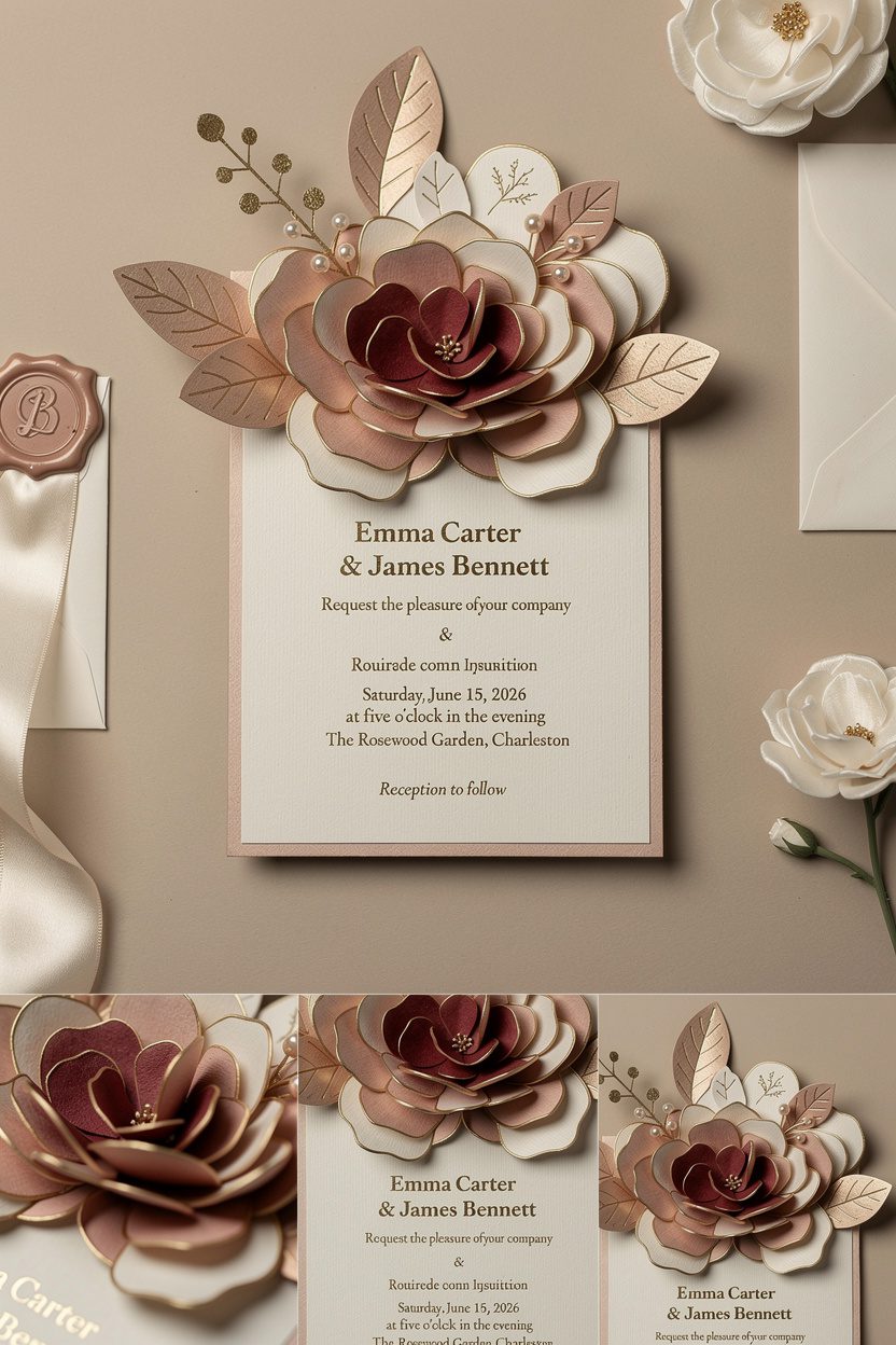
Imagine a sculptural bouquet that unfolds in layers as the card opens—petals rising, leaves extending, the whole thing blossoming in slow motion.
No clichés here; think high-fashion floral. How to nail it:
- Choose premium paper: Duplexed cotton stock for the base, plus pearl or silk-finish paper for petals. You want weight and texture.
- Use tonal color layers: Deep rose layered with blush and a hint of metallic gold edging. Very “couture runway.”
- Hide the mechanics: Conceal tabs with printed foliage; match inks to paper edges for that seamless look.
Scented, But Subtle
Add a micro-encapsulated rose or neroli fragrance to the inner bouquet.
It releases on movement—light, not department-store-counter. IMO, one scent note beats a cocktail.
Personalization Ideas
- Foil monograms on a translucent vellum overlay
- Custom wax seal with a minimal crest
- Hand-applied pearl or crystal accents (sparingly—classy, not craft hour)
Design #2: Architectural Pop-Up Venue (Miniature Cathedral Vibes, Anyone?)
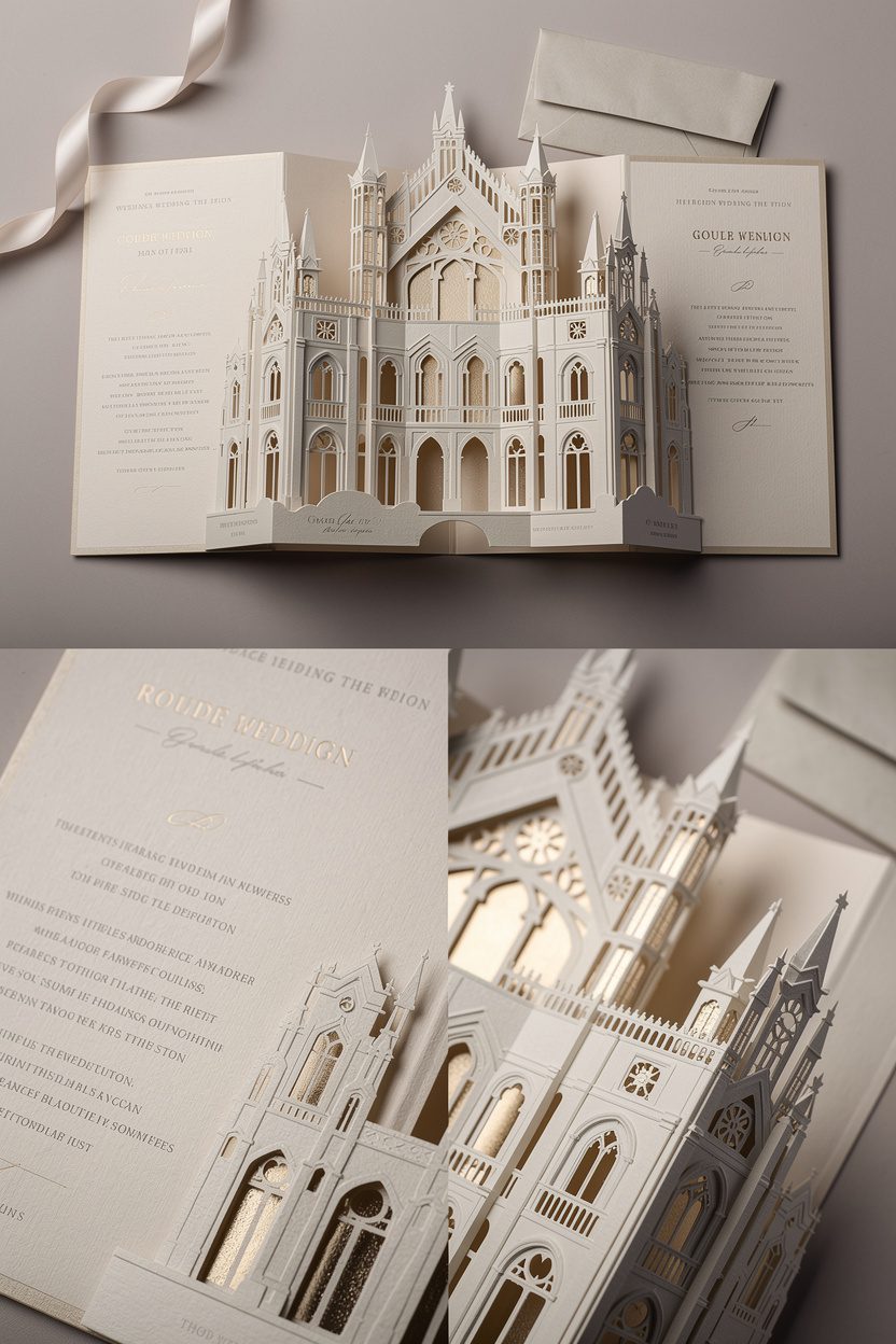
Go for a laser-cut silhouette of your venue: arches, columns, the iconic façade. When the card opens, the structure rises up like a micro-installation.
Guests love this. They’ll flip it open repeatedly like kids with a new toy, FYI. Key features:
- Multi-layer depth: Foreground arches, mid-layer windows, background spires. The more planes, the richer it feels.
- Precision cutting: Laser-cutting keeps lines crisp; add metallic inlays behind windows for a subtle glow.
- Neutral palette: Ivory, stone, champagne.Let the architecture speak without color shouting.
Make It Interactive
Add a tiny pull tab that shifts a door open or reveals your date. It’s a micro-moment that makes guests feel like insiders.
Design #3: Kinetic Geometrics for the Modern Minimalists
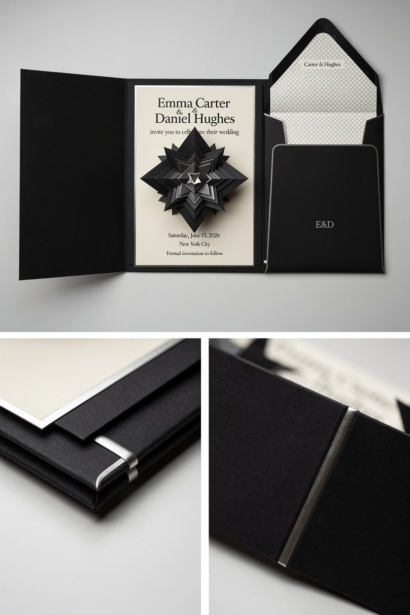
Not into florals or castles? Try a kinetic-engineered pop-up that rotates into geometric shapes—think nested diamonds or a starburst that locks into place.
It screams gallery-chic. What sells the luxe factor:
- Monochrome with one accent: Black and ivory with a platinum foil line. Clean, intentional, expensive-looking.
- Magnetic closure: Hidden magnets keep the piece sleek and satisfying to open. That click?Chef’s kiss.
- Soft-touch lamination: Velvet-feel coating on the outer jacket adds instant drama without shouting.
Typography That Doesn’t Try Too Hard
Stick to a high-contrast serif paired with a delicate sans. Oversized date, minimal text. White space = money.
Design #4: The Luxe Travel Narrative (Pop-Up Itinerary Meets Storybook)

Destination celebration?
Build a pop-up that unfolds in chapters: the ceremony scene, the after-party lounge, the farewell brunch. Each spread pops with miniature elements that tell your story. Smart upgrades:
- Illustration style: Watercolor washes + fine-line ink details. Whimsical yet refined.
- Interactive inserts: Tiny swing tags or foldout maps tucked under ribbon tabs.People love discovering layers.
- Gilded edges: Hand-gilded page edges for the keepsake-book feel.
Practical, But Pretty
Add a slim pocket for RSVP and QR codes. Print the QR on vellum so it floats over a map illustration. Functional doesn’t have to be boring.
Design #5: Celestial Constellations That Light Up
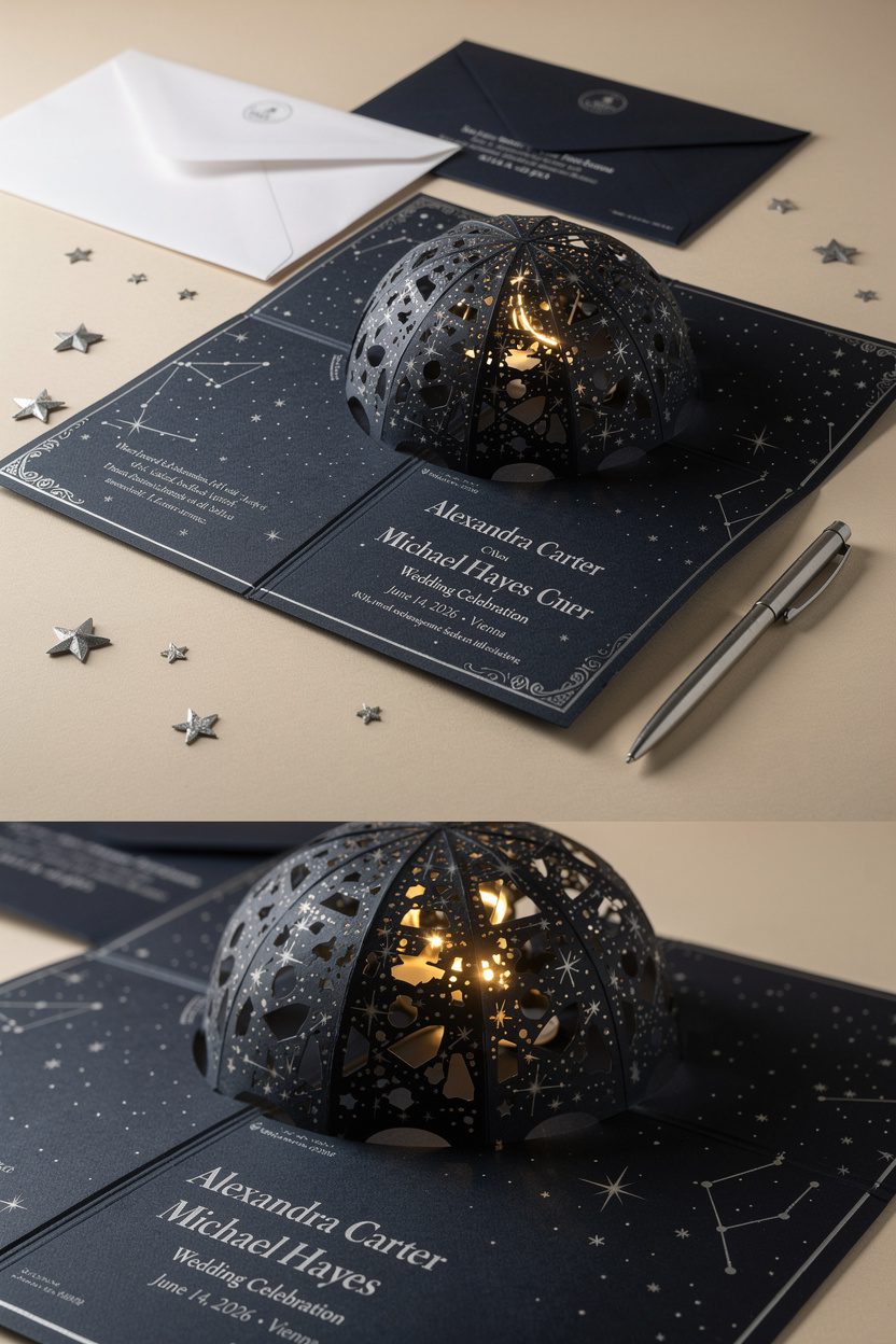
Go full-night-sky glamour: a star dome that pops into a hemisphere, with constellations cut out so light peeks through.
You can even add an LED module (flat, hidden) that makes stars glow when opened. Details that matter:
- Deep navy or obsidian stock: Pair with silver micro-foil for starlight sparkle.
- Fiber optics or micro-LEDs: If you want the wow factor, embed a tiny battery cell. Keep it removable for recycling.
- Cosmic calligraphy: Use pearlescent ink for names—subtle shimmer, not glitter bomb.
Sound, But Make It Tasteful
A soft harp or ambient chime when the card opens can feel magical. Keep it under three seconds.
We’re aiming for celestial, not musical greeting card chaos.
Design #6: The Champagne Reveal (Because, Obviously)
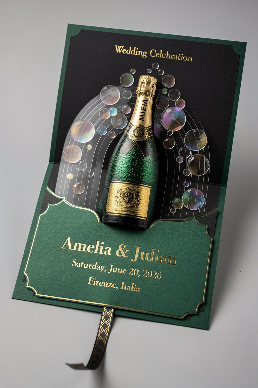
This one pops—literally. The card opens to a sculpted bottle with cascading arcs that mimic bubbles. Hide translucent acetate circles with iridescent foil to sell the effervescence. Finish it right:
- Foiled label with your crest: Gold on satin green or matte black.
- Embossed pressure label texture: Like a real bottle—tiny detail, big impact.
- Ribbon pull for RSVP: Match the “foil champagne cage” motif for cohesion.
Materials and Finishes That Scream Class
You can design brilliantly and still miss the mark if materials fall short.
Want that luxe finish? Stack these:
- Paper: 100% cotton, duplexed museum board, or pearlized card for accents. Avoid flimsy stocks.
- Inks: Pantone spot colors for consistency, plus hot foil in champagne, rose gold, or gunmetal.
- Textures: Letterpress for depth, blind embossing for subtlety, soft-touch lamination for a velvety feel.
- Edges: Gilded, painted, or beveled edges add instant polish.
- Hardware: Hidden magnets, silk ribbon spines, and vellum wraps make everything feel intentional.
Engineering 101 (Without the Headache)
- Prototype in plain cardstock first—refine folds, adjust tension, then upgrade materials.
- Score every fold.Clean scores prevent cracking on luxe stocks.
- Use strong, archival adhesives. Nothing ruins the vibe like lifting tabs.
Custom Touches That Tell Your Story
Personalization isn’t just monograms. Think custom crests that include your pets, favorite flowers, or coordinates of where you met.
Add a subtle timeline element—one icon per “chapter” of the pop-up. Ideas to steal:
- Satin belly band printed with your vows in microtype
- Hidden message behind a flap—private, romantic, 10/10 adorable
- Hand-calligraphed guest names on the pop-up itself for extra wow
Working With a Designer vs. DIY
If you want high stakes (and high shine), collaborate with a pop-up specialist. They understand tolerances, hinge stress, and assembly sequences.
They’ll save you from crying over a pile of misaligned tabs. DIY can work if you keep it simple: one central mechanism, minimal layers, and lots of testing. FYI, laser cutters and craft plotters make clean cuts, but you still need patience.
FAQ
How early should we start the design process?
Start 4–6 months before mailing.
Complex pop-ups, foil plates, and hand assembly take time. If you want custom illustration or LED integration, add another month. Rush jobs exist, but they cost more and add stress—IMO, not worth it.
Are pop-up invitations mailable without damage?
Yes, with the right packaging.
Use a rigid mailer, foam or tissue buffering, and sometimes a shallow box if the mechanism sits tall. Ask your printer for a “compression test” sample to ensure it survives sorting machines.
What’s a realistic budget for luxe 3D pop-ups?
Expect $18–$45 per suite for high-end materials and hand assembly, more with electronics or book-style builds. Quantity lowers unit cost.
If a quote comes in suspiciously low, something’s getting cut—usually quality.
Can we make pop-ups eco-friendly?
Absolutely. Choose FSC-certified cotton or bamboo stocks, soy inks, and avoid PVC elements. For LEDs, use removable modules so guests can recycle the paper.
Sustainable can still look couture.
Do pop-ups work for save-the-dates or just invitations?
They work beautifully for both. For save-the-dates, choose a simpler mechanism—like a single bloom or geometric fold—then go grand for the invitation. It builds anticipation without blowing your entire budget early.
What about accessibility for guests with low vision?
Use high-contrast type, minimum 12–14pt body text, and tactile cues like embossing.
Add a QR code linking to a screen-reader-friendly version. Luxe includes everyone, IMO.
Conclusion
3D pop-up designs bring that “whoa” factor that flat invites can’t touch. Whether you lean floral couture, architectural chic, or celestial glam, the right materials and smart engineering turn paper into an experience.
Choose a design that tells your story, invest in clean finishes, and let the reveal do the talking. Your guests won’t just open the invitation—they’ll remember it.