Nothing kills wedding excitement faster than an invitation that feels like homework. You want chic, not stressful; elegant, not extra. Simple wedding invitations do that heavy lifting with zero fuss—and they quietly tell your guests, “This party will be stylish.” Let’s strip the noise and build something beautiful that still feels like you.
Why Simple Wins Every Time
Minimalist invitations don’t scream for attention—they command it.
Clean layouts, thoughtful typography, and a well-chosen paper stock create a vibe that says, “We’ve got taste, we just don’t need to shout.” Plus, simple designs keep you from drowning in choices. Bonus: simplicity saves money, time, and sanity. You’ll dodge endless rounds of design tweaks and avoid 17 inserts that end up in a drawer. And your guests?
They’ll actually read what they need to know.
Start With The Essentials (And Ditch The Rest)
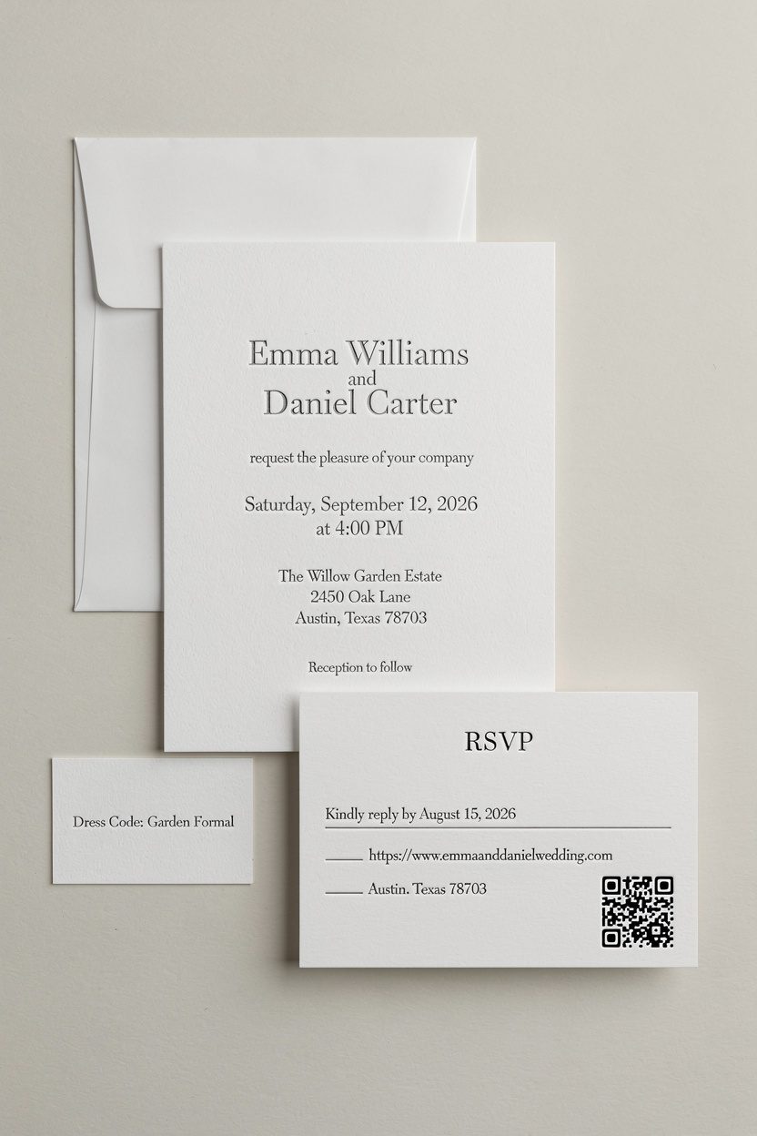
If you remember nothing else, remember this: your invitation needs clarity more than decoration. Include the essentials and you’re golden.
- Names – You two, obviously. Use full names if you want a formal vibe.
- Date and time – Don’t make people guess.Spell it out.
- Venue – Name + city, and the full address if the venue is obscure.
- RSVP – Card, website, or QR code—choose one and make it clear.
- Dress code – Optional, but helpful. “Garden formal” beats “???”
What to skip: paragraphs about your love story, registry info (FYI, put that on your website), and five different maps. Keep it clean, keep it calm.
Fonts, Colors, Paper: The Minimalist Power Trio
You don’t need lace, foil, and watercolor to look elegant. You need good typography, a restrained palette, and paper that feels luxe.
Typography That Does The Talking
Pick one font family and stick with it.
If you want a little flair, pair a crisp serif with a subtle script for your names only.
- Serifs (Garamond, Caslon, Canela): classic and formal without feeling stuffy.
- Sans-serifs (Avenir, Proxima Nova, Suisse): modern, clean, effortless.
- Script accents (Monoline styles): use sparingly—no tangled flourishes.
Pro tip: prioritize hierarchy. Larger names, medium venue/date, smaller supporting details. Your guests’ eyes will thank you.
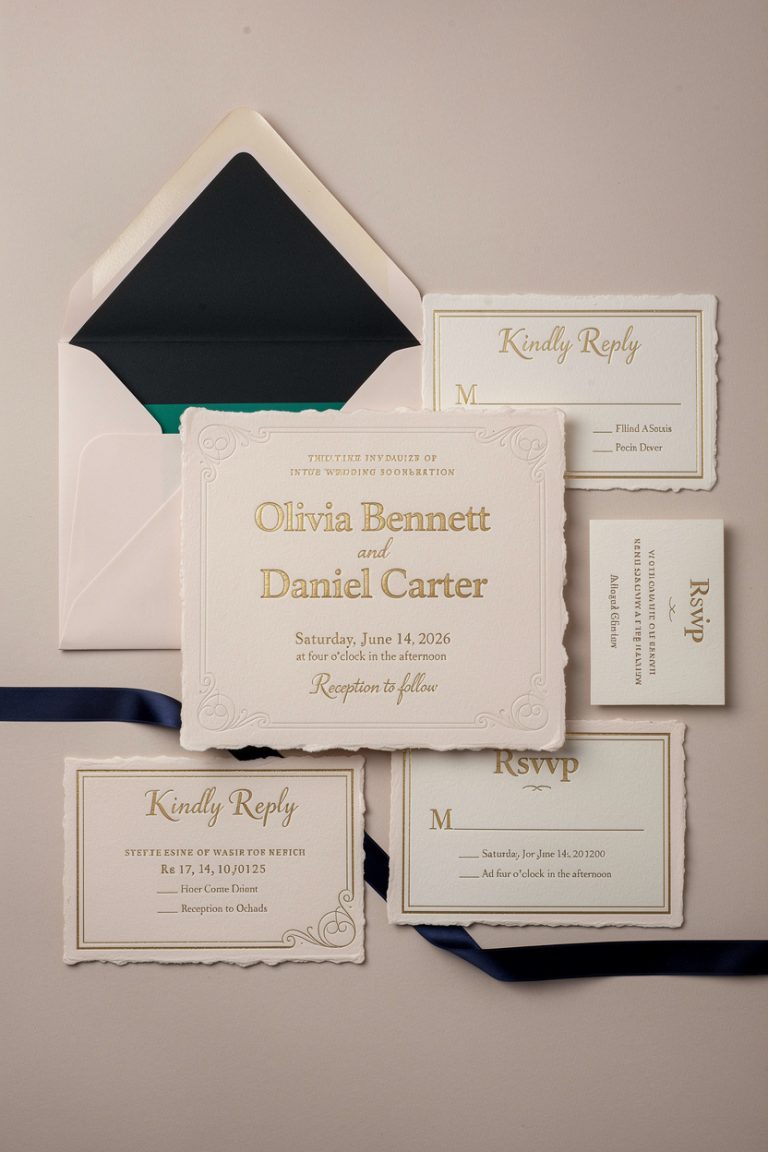
Color Palettes That Keep It Chic
Minimal doesn’t mean white-only (unless you love white—respect).
Aim for 1–2 colors max.
- Timeless neutrals: ivory, soft gray, charcoal, black.
- Soft accents: sage, dusty blue, blush, sand.
- High contrast: black ink on luxe cotton paper—always stunning.
IMO: metallics look best in tiny doses. Think thin border or initials, not full gold fireworks.
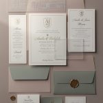
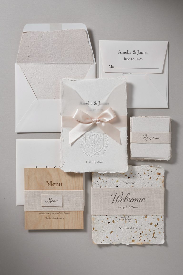
Paper That Feels Like “Wow”
Paper is the secret sauce. Even the simplest design looks rich on the right stock.
- 110–160 lb cover for sturdiness.Heavier feels fancy.
- Cotton or eggshell textures for a soft, tactile finish.
- Letterpress if budget allows—minimal text, big impact.
Layouts That Breathe
Whitespace is your friend. Let the design breathe so nothing feels crowded. Centered layouts feel classic; left-aligned layouts feel modern.
Pick one and keep the spacing consistent.
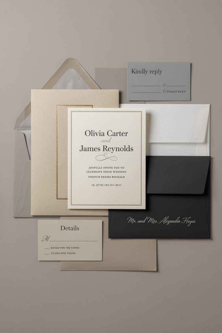
A Simple Structure That Works Every Time
- Top: your names (largest text)
- Middle: invite line (“invite you to celebrate…”) or skip it for ultra-minimal
- Details: date, time, venue, city
- Bottom: RSVP direction (website or QR code)
Try this: one invitation card + one details card + envelope. That’s it. If guests need more info, send them to your website, not a stack of inserts that could double as origami paper.
Subtle Embellishments That Still Feel Simple
You can add personality without clutter.
Think small, intentional touches.
- Blind deboss (inkless imprint) for initials or a tiny monogram.
- Monochrome ink on textured paper for depth without distraction.
- Thin border or rule lines to frame content lightly.
- Wax seal on the outer envelope for drama—minimal design, neutral color.
- Vellum overlay with a single line of text or date (optional, not necessary).
FYI: if you choose one standout feature (e.g., letterpress), skip the rest. Let the craft shine.
Digital vs. Print: Choose Your Lane

Both can look incredibly elegant if you do them right.
The key? Consistent branding across formats.
Printed Invitations
Perfect for keepsakes and that “ooh” moment when guests open the envelope.
- Pros: tactile luxury, formal tone, customizable finishes.
- Cons: higher cost, longer timelines, postage logistics.
Digital Invitations
Great for tight timelines, destination weddings, or eco-friendly couples.
- Pros: instant delivery, easy RSVPs, budget-friendly.
- Cons: fewer tactile moments, potential email purgatory.
Hybrid idea: mail a simple printed invite and drive RSVPs to your website with a short link or QR code. Best of both worlds.
Envelope Etiquette (Without the Fuss)
Your envelope sets the tone.
Keep it simple with a clean label or neat calligraphy, and don’t sleep on stamps.
- Outer envelope: names, address, and a well-chosen stamp. Vintage stamps? Chefs kiss.
- Inner envelope: optional.Use it if you love layers, skip if you don’t.
- Return address: print it on the flap—easy and tidy.
Color tip: white, cream, or soft gray envelopes instantly elevate the look. If you choose a colored envelope, keep the card neutral to balance it.
Budget Moves That Still Look Luxe
You can get that “effortless elegance” without maxing your credit card. The trick: focus spend where it shows.
- Invest in quality paper and clean typesetting.
- Use one special process (letterpress or foil) on names only.
- Print in one color to save costs and keep it minimal.
- Order 10% extra to avoid rush reprints later.
DIY but make it classy: design in a tool like Canva with pro fonts, then print through a reputable printer.
Ask for a sample kit first so you can feel the paper and see the ink.
FAQ
How early should I send simple wedding invitations?
Aim to mail them 8–10 weeks before the wedding. If you’re hosting a destination event or peak-season date, 12 weeks feels safer. Send save-the-dates 6–8 months out so people can plan flights and babysitters.
Do I need separate RSVP cards if I’m keeping it minimal?
Nope.
You can absolutely direct guests to a website or include a tiny QR code on the back. If you want a traditional feel, add a small RSVP card with a pre-addressed, stamped envelope—just keep the design stripped down.
What’s the best wording for minimalist invitations?
Short and clear wins. For example: “Ava Morgan and Theo Rivera invite you to celebrate their wedding.
Saturday, September 14, 2026, at four o’clock. The Greenhouse at Willow Park, Portland, Oregon. RSVP: avatheo.com.” You can skip the formal invite line entirely for a cleaner look.
Can simple invitations still match my wedding theme?
Totally.
Use a subtle color nod (sage for a garden vibe, slate for urban chic), a tiny motif (like a leaf or line art), or a specific font style. Keep it consistent across your website, menus, and signage for quiet cohesion.
What paper size works best for a minimalist look?
A7 (5″ x 7″) feels classic and frames content nicely. If you want ultra-modern, try a 5″ x 5″ square or a slim DL-style card—but check postage rules first.
Simplicity still needs practicality, IMO.
Are envelope liners necessary for a clean design?
Not necessary, just nice. If you want one, pick a solid color or a whisper-light pattern. Avoid busy prints that steal the spotlight from your beautifully minimal card.
Conclusion
Simple wedding invitations aren’t boring—they’re intentional.
They let great typography, thoughtful spacing, and quality paper do the flexing. Strip out the fluff, keep the essentials, and add one small detail that feels like you. That’s effortless elegance—easy to design, dreamy to open, and impossible to forget.