You want wedding stationery that looks chic, feels luxe, and practically whispers “this couple has taste.” Enter layered 3D invites. They stack textures, shapes, and materials to create depth you can actually feel. No flat, flimsy cardstock here—just dimensional magic that sets the tone for a modern celebration.
Why Layered 3D Invites Steal the Show
Layered invites grab attention the second someone opens the envelope.
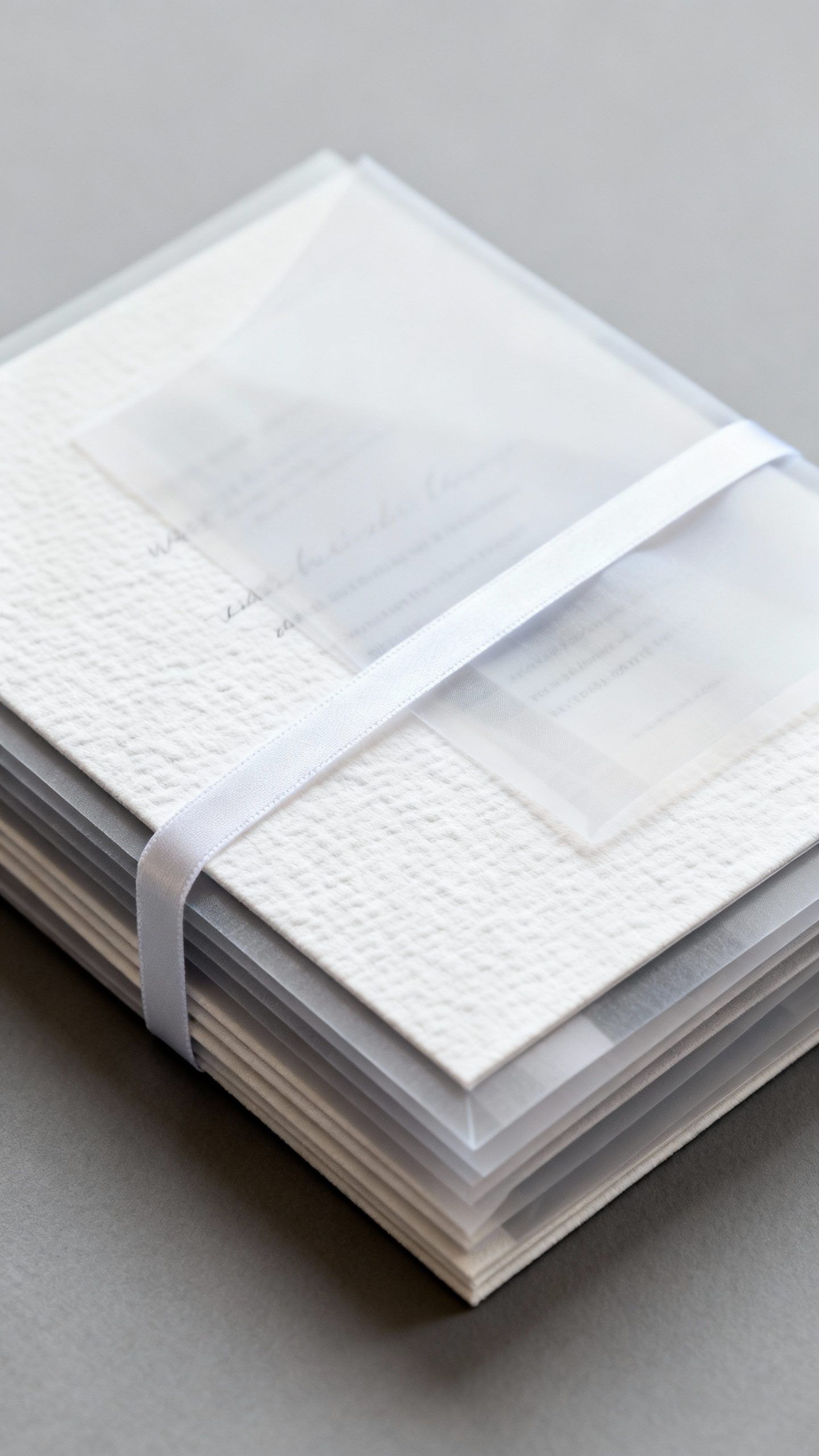
They deliver visual depth and tactile drama in a way flat prints simply can’t. Think of them as the couture dress of stationery. You can mix paper stocks, acrylic, vellum, and foil to build contrast.
The result? A design with movement, shadow, and light that communicates style at a glance. Honestly, they’re the kind of invite your guests keep on their fridge long after the wedding.
Core Elements That Make 3D Invites Work

Want that high-end, layered look without chaos? Balance is everything.
Here’s what to focus on:
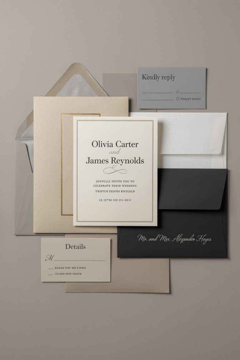
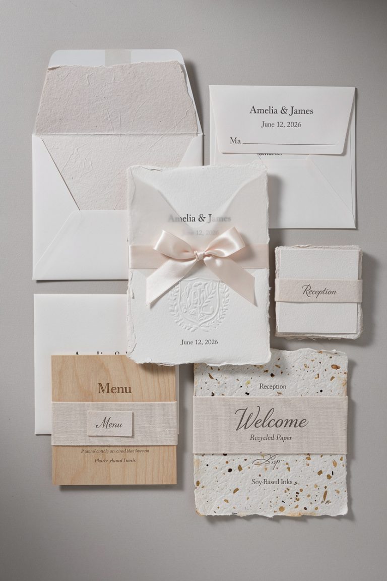
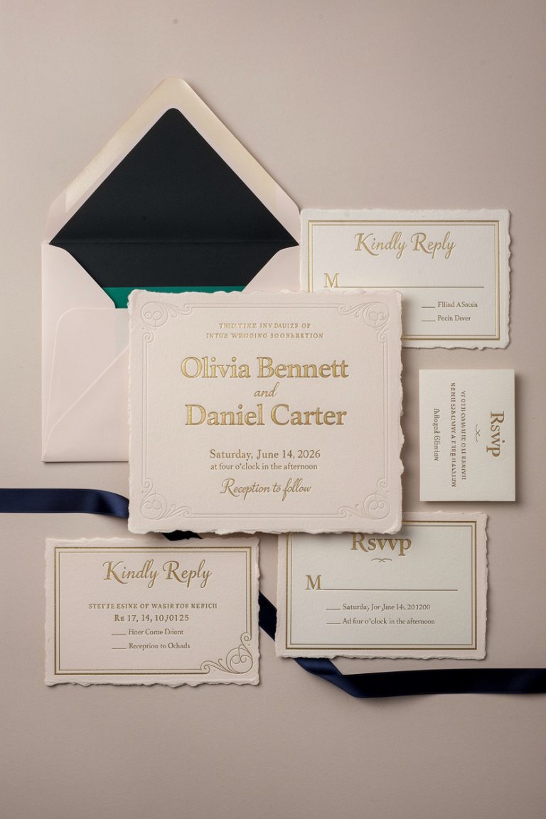
- Base layer: The foundation. Usually a heavyweight cardstock (cotton, linen, or double-thick) that carries the key info.
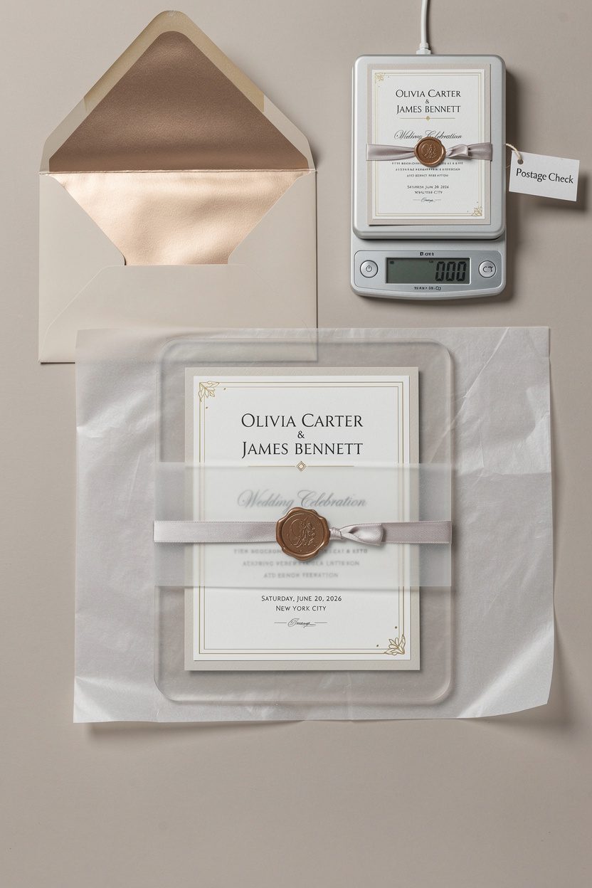
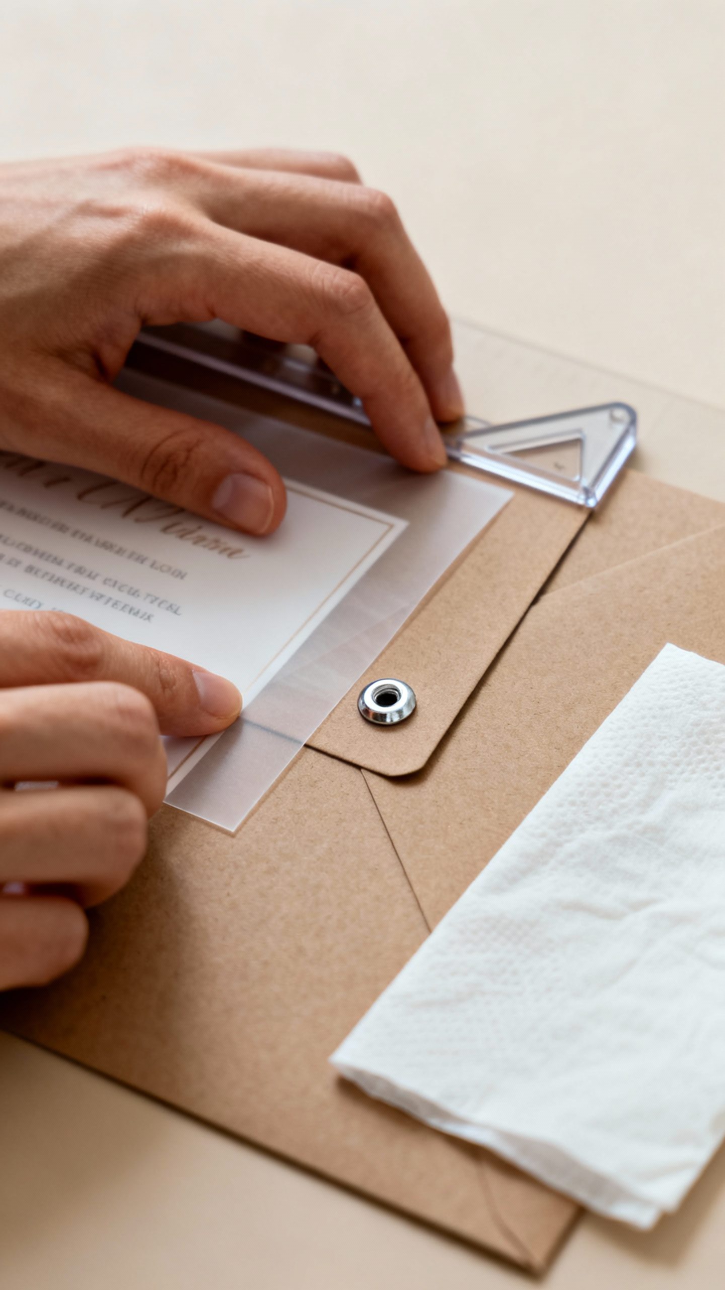
- Overlay: Vellum, translucent paper, or acrylic that adds texture and a peekaboo effect.
- Accent layer: Foil borders, letterpress plates, deckled edges, or die-cut shapes for dimension.
- Fastener: Ribbon, wax seal, grommet, or eyelet to secure layers in a clean, intentional way.
- Typography: Contrasting fonts (one serif, one clean sans) to keep hierarchy clear and modern.
Materials That Feel Luxe
– Acrylic: Crisp, modern, and mirror-like with white ink. Pairs beautifully with minimalist layouts.
– Vellum: Ethereal and budget-friendly, perfect for overlays with subtle graphics.
– Textured papers: Cotton and linen stocks give instant sophistication and fantastic print results.
– Foil and letterpress: Shine and shadow that read “premium” at first touch.
Design Ideas That Actually Look Modern
The trick: keep it clean, edit ruthlessly, and let the materials shine.
Here are a few combos that just work:
The Minimalist Stack
– Base: Thick white cotton stock with blind-debossed monogram
– Overlay: Frosted vellum printed with the names in oversized type
– Fastener: Slim white ribbon or micro grommet in silver
– Palette: White, soft gray, a hit of metallic
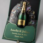
Soft Romance, But Make It Modern
– Base: Blush deckled-edge cardstock with letterpress text
– Accent: Gold foil border or foil-stamped botanicals at the corners
– Overlay: Sheer vellum with a delicate floral outline
– Fastener: Wax seal in champagne or dusky rose
Architectural Chic
– Base: Charcoal cardstock with white ink
– Layer: Clear acrylic panel laser-etched with the venue illustration
– Accent: Geometric die-cut top edge
– Fastener: Matte black eyelet or minimalist paper clip (yes, FYI, it’s a vibe)
How to Keep It Practical (And Mailable)
3D invites can spiral into bulky territory fast. You want drama, not postage panic. Here’s how to keep it sane:
- Check weight early: Ask your stationer for a prototype and weigh it with the envelope.Anything over one ounce triggers extra postage.
- Limit layers: Two to three meaningful layers feel luxe without bulk. Edit, edit, edit.
- Mind the thickness: Acrylic looks great, but 1mm-2mm is your sweet spot for mailability.
- Choose flat fasteners: Wax seals and ribbons can add height. Go for thinner wax or place the seal on a belly band instead of directly on the envelope.
- Protect the goods: Add tissue or glassine to prevent scuffs during shipping.
Assembly Tips So You Don’t Lose Your Sanity
– Stack in the order guests will read: names first, details next, RSVP last.
– Align consistently.
Use a light grid or a corner jig to keep edges straight.
– If you DIY, do a 10-piece test run to get your workflow and timing right. Then multiply. IMO, assembly takes longer than you think.
Personalization That Feels Intentional

You’re not making a scrapbook.
You’re designing an experience. Choose one signature element and repeat it across the suite.
- Monogram: Deboss it on the invite, foil on the menu, wax seal on the envelope.
- Venue sketch: Laser-etch it on acrylic, then print it faintly on the details card.
- Color story: Pick two main colors and one metallic. Repeat them across place cards, programs, and thank-you notes.
- Texture theme: If you use vellum on the invite, echo it on the escort cards or as a menu overlay.
Typography That Reads Clean
– Pair a modern serif for names with a simple sans-serif for details.
– Avoid more than two font families.
Keep it tight.
– Increase letter spacing on all-caps lines for readability and elegance.
– Use hierarchy: names largest, date/time next, venue details third.
Budget-Savvy Ways to Get the Look
You can get that layered feel without selling a kidney. Here’s how:
- Swap acrylic for vellum: You’ll keep translucency and save big on materials and postage.
- Use a single foil hit: Limit foil to names or a border instead of full-coverage designs.
- Choose digital + one specialty process: Digital print the body text, then add letterpress or embossing for dimension.
- Consolidate inserts: Use a QR code for RSVP or accommodations instead of another card.
- DIY assembly: Have your stationer print and cut; you handle ribbon, seals, and stacking.
Common Mistakes (And Easy Fixes)
– Too many layers: Edit to the essentials. Your guests need clarity, not a scavenger hunt.
– Clashing finishes: Pick one hero: foil, letterpress, or acrylic.
The rest should support it.
– Tiny fonts: Small and delicate aren’t the same. Err bigger for legibility, especially on translucent layers.
– Ignoring envelopes: Style doesn’t stop at the door. Use colored envelopes, printed liners, or an outer/inner set for protection and impact.
– Last-minute postage drama: Take a fully assembled sample to the post office before you commit.
Timeline: From Idea to Mailbox
Because beautiful takes time (and your sanity deserves a buffer):
- 6-8 months out: Book your designer or order samples if DIY.
- 5-6 months: Finalize materials, colors, and typography.Approve proofs.
- 3-4 months: Production starts. Specialty processes take longer—plan for it.
- 10-12 weeks: Assemble your suites or schedule professional assembly.
- 8-10 weeks: Mail invites for local weddings; 10-12 weeks for destination.
FAQ
Will layered 3D invites survive the mail?
Yes, with smart planning. Keep weight under control, choose flat fasteners, and add protective tissue.
If you go heavy or use thick acrylic, consider hand-canceling at the post office or mailing in boxes for VIPs.
Are 3D invites eco-friendly at all?
They can be. Use recycled cotton stock, soy-based inks, and avoid plastic when possible. Vellum can be plant-based, and you can skip acrylic or choose recycled acrylic.
Also, print what you need—no vanity extras.
How many layers should I use for a clean, modern look?
Two to three. One base layer for the text, one translucent or textural layer for depth, and one subtle accent (foil, embossed monogram, or a die-cut). More than that can feel busy fast.
Do I need a professional, or can I DIY?
You can DIY if you love crafts and have time.
Order pre-cut pieces, practice assembly, and keep the design simple. If you want letterpress, foil, or acrylic etching, a pro will save you headaches—IMO, it’s worth it for hero pieces.
What’s a good color palette for a modern vibe?
Neutrals with one intentional accent. Think ivory + fog gray + black foil, or sand + sage + warm gold.
Keep it restrained and let texture do the talking.
How do I tie the invite design into the wedding day?
Repeat the hero element everywhere. Use the same monogram on menus, mirror the vellum overlay on programs, or carry the foil color into table numbers and place cards. Consistency = elegance.
Conclusion
Layered 3D invites do more than announce your wedding—they set the mood with texture, light, and detail.
Pick a few quality materials, keep the design edited, and obsess over assembly and postage. You’ll end up with stationery that feels modern, thoughtful, and yes, extremely frame-worthy. FYI: your guests will notice—and they’ll keep them.