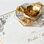
Your wedding invites deserve a main-character moment, and geometric 3D designs deliver it. Think sleek angles, layered textures, raised foil, and shapes that practically jump off the paper. They’re bold, modern, and very 2026.
Ready to ditch the lace swirl clichés and send something your guests will actually keep? Let’s build your invite stack like a piece of art.
Why Geometric 3D Invites Are Having a Moment
Geometric shapes feel fresh because they strike that sweet spot between structured and playful. Triangles, hexagons, and arches bring rhythm and balance, while 3D layers add depth and drama.
The combo turns an invite into a tactile experience—your guests won’t just read it; they’ll touch it, tilt it, and take photos. You also get massive flexibility. Want minimalist?
Go with clean lines and subtle embossing. Want glam? Stack acrylic, foil, and letterpress like a cake. Geometric 3D gives you a design language that scales to your vibe and budget.
Design Elements That Scream 2026 (In a Good Way)
Let’s talk the building blocks.
Mix and match these to craft something that feels custom—not cookie-cutter.
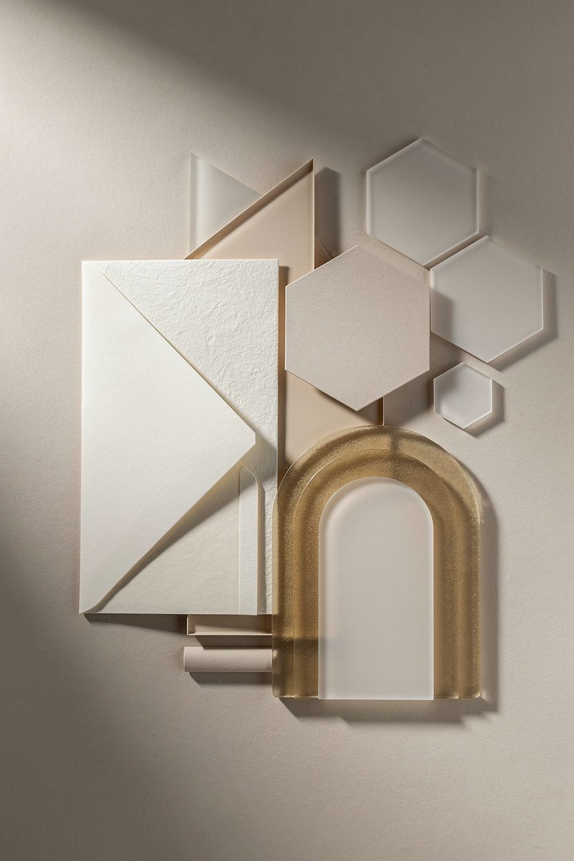
- Layered panels: Stack translucent vellum over a solid geometric pattern. Add a die-cut arch or hex for instant dimension.
- Embossing + debossing: Raise or sink lines and shapes for a subtle 3D effect. It reads luxe without shouting.
- Foil accents: Gold, rose, or holographic foil along edges or linework.Foil works best as a detail, not a blanket.
- Acrylic and frosted materials: A frosted acrylic top layer with printed shapes underneath? Chef’s kiss.
- Geometric frames: Think clean borders, repeating shapes, or an offset layout that guides the eye.
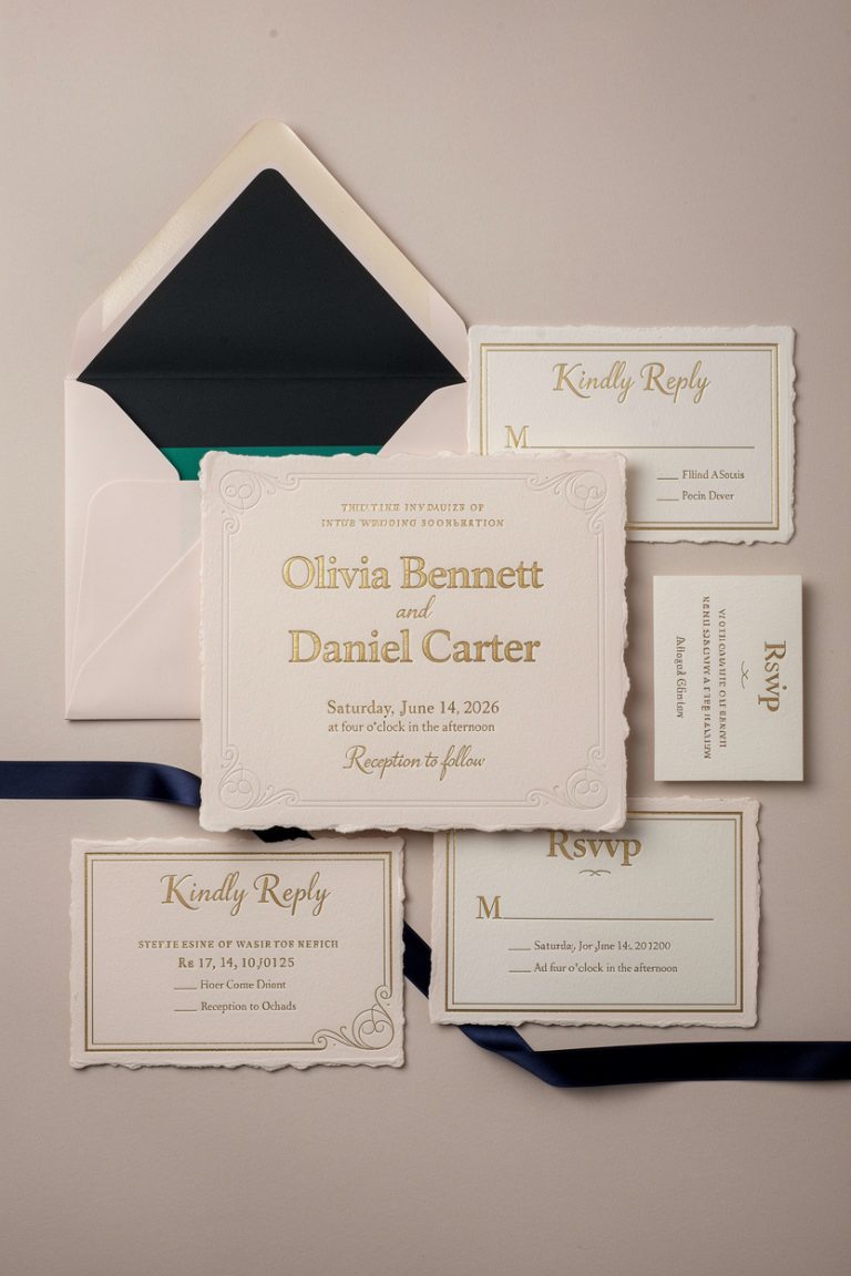
- Die-cut edges: Arches, angles, or scalloped geometry (yes, scallops can be geometric) for a sculpted silhouette.
Color Palettes That Hit Different
You don’t need neon for impact. 2026 leans into contrast and texture.
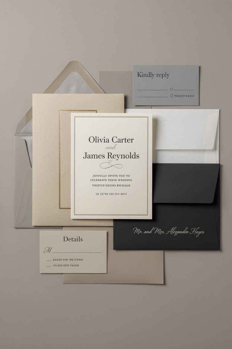
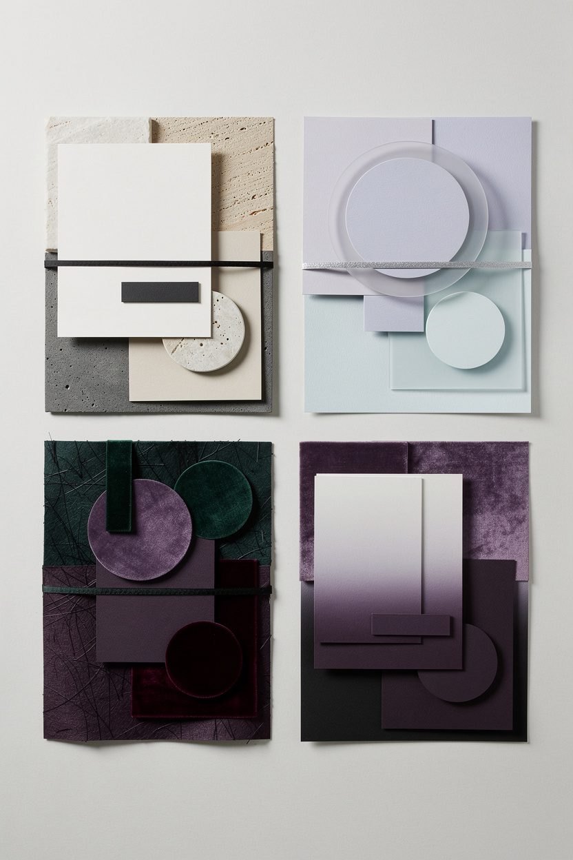
- Modern neutrals: Stone, sand, charcoal, and ivory with matte black type. Understated and timeless.
- Soft futurism: Misty lilac, ice blue, pale sage with silver foil.Calm but forward.
- Jewel tones: Emerald, amethyst, and garnet on textured stock. Dramatic, rich, and very photo-friendly.
- Monochrome gradients: One hue across light-to-dark layers for subtle depth.
3D Done Right: Texture Without Chaos
You want dimension, not clutter. The trick?
Choose one hero technique and let it lead.
- Pick a focal point: Maybe it’s a raised geometric pattern, maybe it’s a die-cut hex frame. Don’t make everything shout.
- Balance your materials: If you go acrylic on top, keep the backer simple. If you emboss, skip heavy foil flooding.
- Mind the weight: USPS won’t love your six-layer masterpiece.Keep it under 1 ounce unless you plan for extra postage.
Smart Typography Pairings
Geometric designs and great fonts go together like cake and frosting.
- Sans + Serif: A crisp sans for details with a refined serif for names. Clean and romantic.
- All-caps minimal: Use letter spacing and line breaks for structure—no script needed.
- One statement letter: A large initial subtly debossed behind the text = chef-level restraint.
Format Ideas You’ll Want to Steal
You don’t need to reinvent the wheel—just sharpen it.
- The Stacked Suite: Invitation on textured card, details on vellum with geometric border, RSVP as a small die-cut shape.
- Gatefold Geometry: A tri-fold with angled cuts that fit together like a puzzle. Open the folds and reveal the foil-stamped date.
- Frame-It Invite: A cut-out window framing your monogram or venue illustration in low-relief embossing.
- The Acrylic Topper: Thin frosted acrylic front with print, mounted on a colored cardstock backer with metallic edge paint.
- Arch Ensemble: All cards in arched shapes of varying heights.Instant dimension without extra materials.
QR Codes, But Make It Pretty
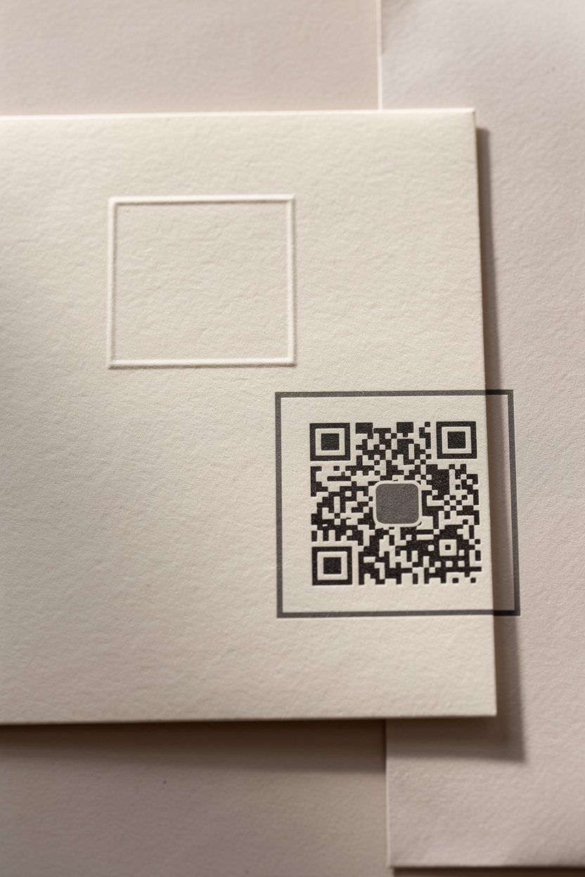
Yes, QR codes can look chic. Print a small, high-contrast code inside a geometric frame or as a debossed box. Link it to RSVP, a wedding website, or directions. Keep it tiny but scannable—no one needs a billboard QR on an invite, FYI.
Materials That Elevate the Experience
The paper (or not-paper) matters as much as the design.
The tactile stuff sells the 3D effect.
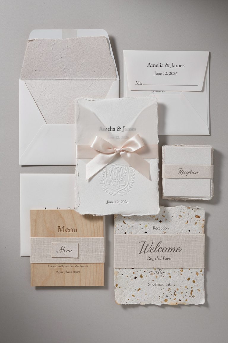
- Cotton stock: Thick, soft, and perfect for letterpress and embossing.
- Eggshell or vellum finish: Slight texture that catches light without glare.
- Acrylic: Frosted looks modern and photographable; clear reads ultra-sleek.
- Edge painting or gilding: Adds a luxe pop when stacked—think metallic copper on deep green.
- Eco options: Recycled stock, seed paper for inserts, or soy-based inks if you want style and sustainability.
Printing Techniques: What to Use When
– Letterpress: Deep, pillowy impressions—best on thick cotton stock. – Foil stamping: Shiny, crisp lines—great for geometric borders and names. – Thermography: Raised ink look for less than engraving—use sparingly for clean shapes. – Digital + Spot UV: Smooth print with glossy raised accents for modern contrast.
Budgeting (Without Tears)
You can get the 3D look without a 3D price tag. Prioritize one premium element and keep the rest streamlined.
- Choose one hero technique (embossing or foil, not both everywhere).
- Use vellum overlays to create depth instead of thicker or multiple boards.
- Go standard sizes to avoid custom envelope costs.
- Print the main invite fancy and keep inserts digital via QR code.
- DIY assembly: tie with silk ribbon or wax seals at home (yes, it’s weirdly relaxing).
Timing Tips
– Design: 6–8 weeks to iterate without panic. – Production: 2–4 weeks for specialty finishes (longer for acrylic/die-cuts). – Mailing: Send 8–12 weeks before the wedding; destination weddings need more lead time.
Make It Cohesive With the Rest of Your Day
Your invites set the tone. Mirror those shapes and finishes across your wedding.
- Signage: Arch or hex welcome signs with layered acrylic.
- Table numbers: Minimal geometric stands with foil accents.
- Menus and place cards: Small die-cut shapes or letterpressed patterns.
- Cake design: Angular tiers, metallic lines, or textured fondant.
- Dance floor decal: Oversized geometric monogram for a “wow” moment.
Personalization That Feels Intentional
Skip the generic monograms. Try a custom geometric motif based on your venue architecture, your initials, or even your zodiac shapes (if that’s your thing). Use the motif across stamps, seals, napkins, and thank-you cards for an effortless brand moment.
FAQ
Are geometric 3D invites too “trendy” to feel timeless?
Not if you keep the palette and typography classic.
Use geometry for structure and texture rather than wild patterns. IMO, clean shapes age beautifully—especially with great paper and thoughtful spacing.
Will 3D invites cost a fortune?
They can, but they don’t have to. Choose one premium technique (like embossing) and pair it with digital printing and vellum.
You’ll get dimension without the high-end invoice.
Do these designs work for formal weddings?
Absolutely. Pair subtle embossing with rich paper, restrained foil, and a traditional serif. The clean geometry reads sophisticated, not casual.
What about mailing—will they survive the post office?
Yes, with a few precautions.
Keep the overall thickness reasonable, use protective inner envelopes for acrylic or heavy embellishments, and weigh one at the post office for accurate postage. Hand-canceling helps keep them pristine.
Can I include a QR code without ruining the aesthetic?
Totally. Keep it small, high-contrast, and framed within your geometric layout.
Place it on a details card or the back of the invite. Function, meet fashion.
What’s the best way to proof these?
Ask for printed proofs or a sample kit with your paper and finishes. Screens lie.
Touch the materials and check how embossing and foil look in real light, FYI.
Wrap-Up: Your Invite, But Make It Architectural
Geometric 3D wedding invites bring structure, texture, and that “oh wow” unboxing moment. Start with a clear shape language, add one or two dimensional techniques, and choose materials that feel good in hand. Keep it cohesive, intentional, and a little playful.
You’re not just sending information—you’re sending a tiny, tangible preview of the party. And honestly? That’s the kind of extra your guests will remember.