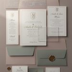
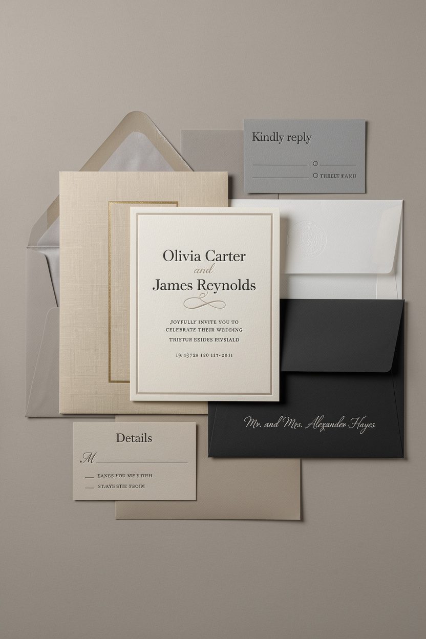
Nothing screams “we’ve got great taste” like a wedding invitation suite in elegant neutrals. It whispers luxury without trying too hard. It looks immaculate on your fridge for months.
And bonus: it plays nice with almost any wedding style, from garden party to black-tie glam. Let’s talk classy wedding invitations in timeless neutrals—and how to make them feel special, not snoozy.
Why Neutrals Win Every Time
Neutrals behave like the little black dress of stationery: endlessly versatile and always appropriate. They set a sophisticated tone without stealing the spotlight from your actual wedding.
You also won’t cringe at them in five years—neutrals age like fine wine. You can pair them with any accent color, switch flowers, or change venues without clashing. Feeling indecisive? Neutrals keep options open until you finalize the rest of your details.
FYI, this alone saves many late-night Pinterest spirals.
Choosing Your Neutral Palette (Without Boring Yourself)
Neutrals go way beyond plain white. Mix tones and textures to add depth and dimension. Think layered shades that look intentional, not accidental.
- Warm neutrals: ivory, cream, champagne, sand, camel
- Cool neutrals: dove gray, slate, stone, mushroom, charcoal
- Modern contrasts: black + white, bone + graphite, linen + deep espresso
Pro tip: Build a three-tone stack
Use a light base (ivory card), a mid-tone layer (greige belly band), and a dark accent (charcoal ink).
This trio reads polished and intentional. It also photographs beautifully, IMO.
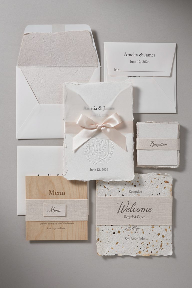
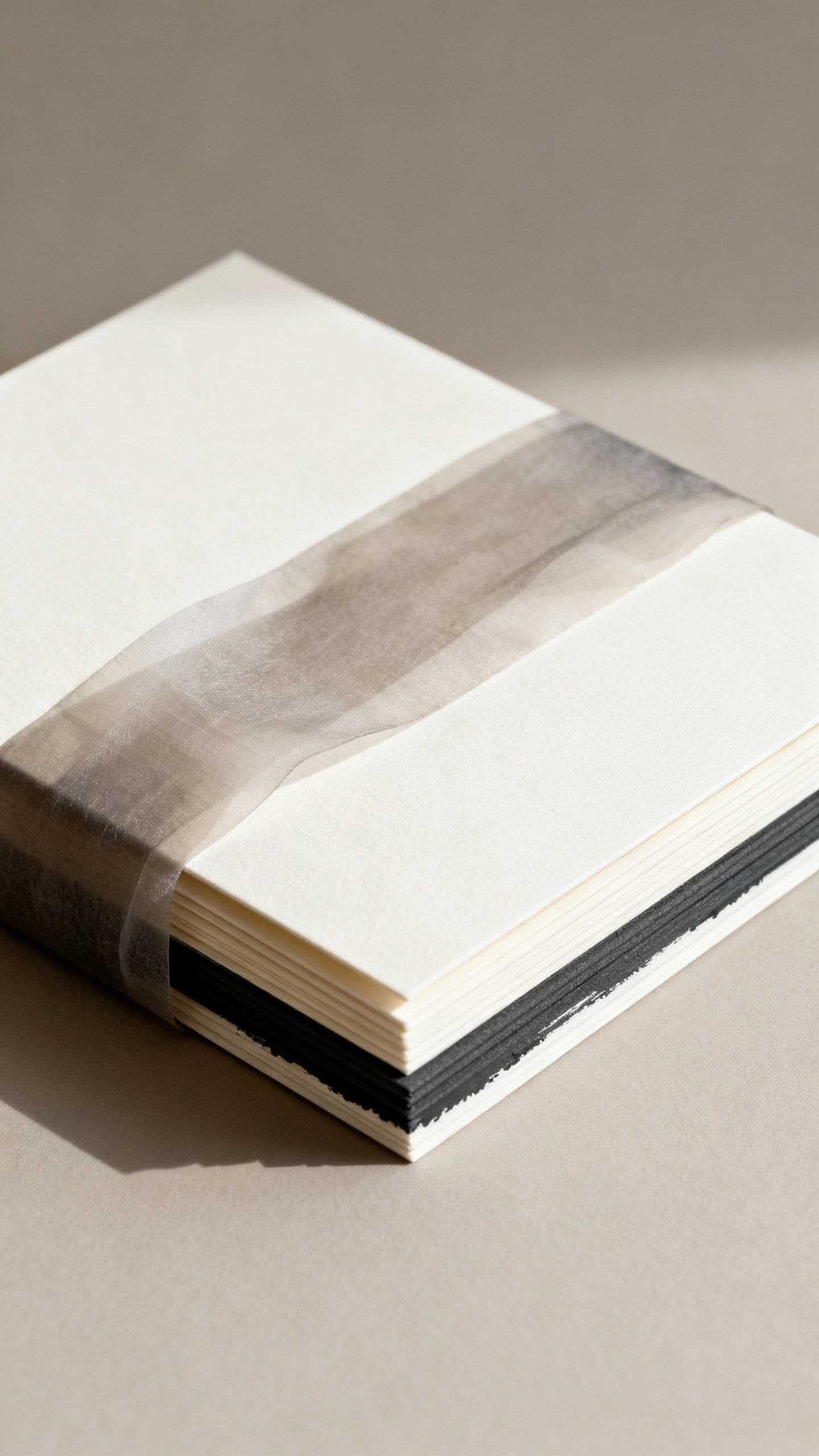
Paper Choices That Feel Luxe
The paper does a lot of the heavy lifting. If you want your neutrals to look anything but basic, start with quality stock.
The difference shows the second someone picks it up.
- Cotton paper (300–600 gsm): soft, pillowy, and very elegant
- Linen or felt textures: subtle texture that catches light nicely
- Vellum overlays: sheer layer for a modern, airy vibe
- Handmade deckle-edge: romantic and artisanal, perfect for neutrals
Finish matters
Matte finishes keep things understated; eggshell adds gentle warmth. Skip super glossy coatings—they can cheapen a neutral palette and glare in photos.
Printing Methods That Elevate the Look
Neutrals plus thoughtful printing finishes? Chef’s kiss.
You can choose one showstopper technique or combine a couple for depth.
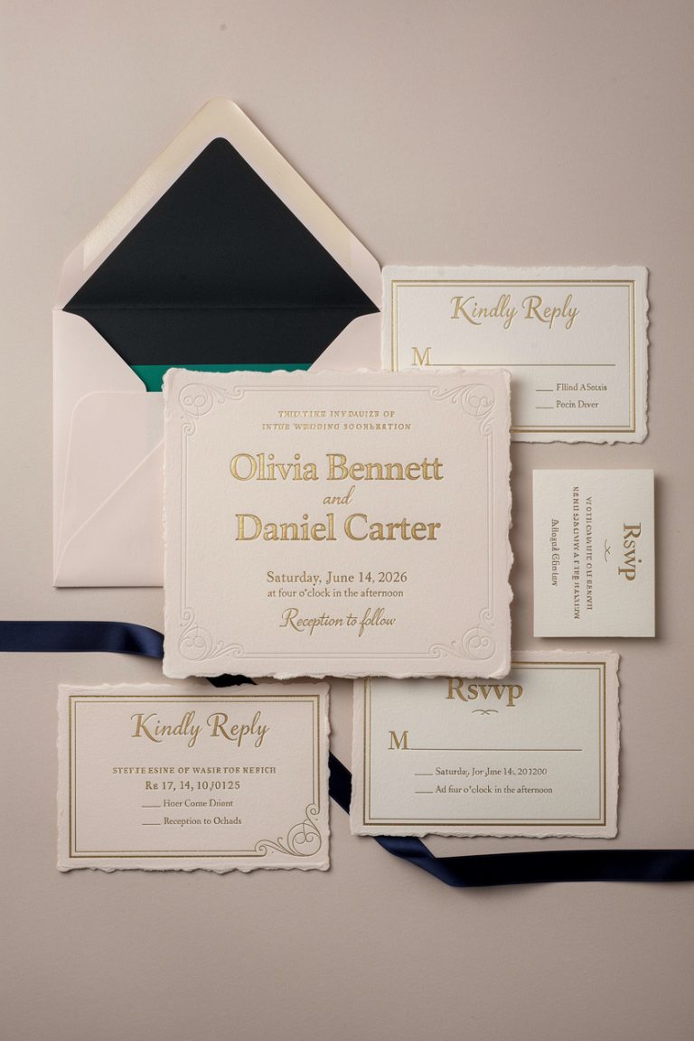
- Letterpress: ink pressed into the paper for a tactile impression; classic and luxurious
- Foil stamping: metallic accents (gold, rose gold, champagne) that pop on neutrals
- Embossing/debossing: raised or recessed details without ink—clean and sculptural
- Thermography: raised ink that mimics engraving on a budget
- Digital printing: great for fine detail and watercolor washes; budget-friendly
Mix, but don’t mash
Pick one star technique (letterpress or foil) and let everything else support it. Too many finishes can look like a craft store exploded. You want harmony, not chaos.
Design Details That Make Neutrals Shine
Minimalist doesn’t mean boring.
Little choices create wow moments in a neutral palette.
- Typography: combine a clean serif with a modern sans, or a refined serif with subtle script. Keep script minimal for readability.
- Monograms or crests: tone-on-tone blind debossing or soft gray ink feels bespoke without screaming.
- Borders and frames: thin rules or blind embossed frames add structure.
- Negative space: let the design breathe; neutrals love airy layouts.
Neutral doesn’t mean colorless
Add hints of muted color that play well with neutrals:
- Soft sage or eucalyptus green
- Blush quartz or dusty rose
- French blue or misty periwinkle
Keep accents under 20% of the design and you’ll maintain a timeless look.
Envelopes, Liners, and All the Little Luxuries
Packaging matters. You’re creating a reveal, not just mailing paper.
Make every layer feel intentional.
- Envelope colors: off-white, stone, fog, or deep charcoal for drama
- Liners: marble patterns, botanical sketches, toile, or solid vellum liners for depth
- Wax seals: champagne, antique gold, or matte taupe with a crest or botanical sprig
- Ribbons and belly bands: silk or cotton in sand, taupe, or slate; vellum bands for a modern edge
- Edge painting or bevels: metallic champagne or matte graphite looks insanely chic
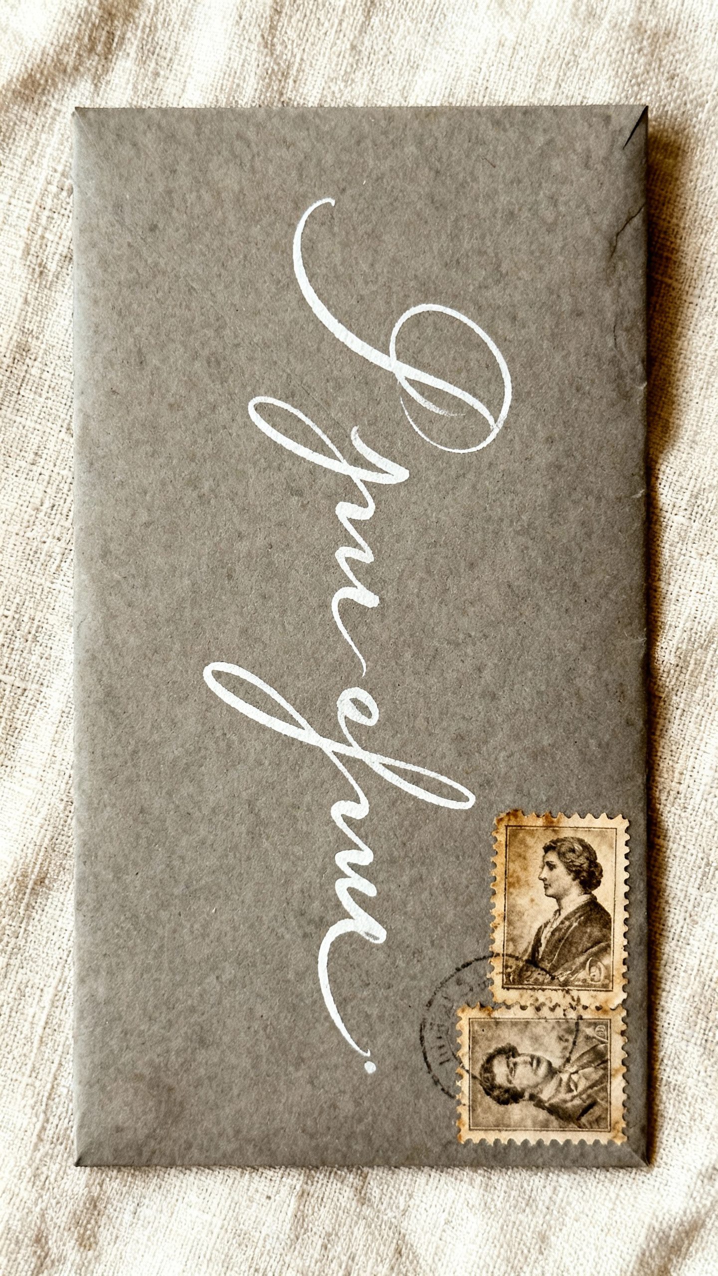
Addressing that looks impeccable
- Calligraphy or faux calligraphy: pairs beautifully with neutrals
- Return address embossing: clean and luxe on the envelope flap
- Coordinated stamps: vintage stamps in tonal palettes for extra charm
How to Keep It Cohesive With Your Wedding Style
Neutrals flex across themes—just tweak materials and details to match your vibe.
- Modern/minimal: crisp typography, wide margins, black and bone palette, maybe a vellum overlay
- Romantic/garden: handmade paper, soft gray ink, floral liner, silk ribbon
- Classic/black-tie: ivory stock, charcoal or black letterpress, blind-debossed monogram, gold foil touch
- Rustic-chic: kraft accents, twine or raw-edge ribbon, warm taupe and cream tones
Carry the neutrals through the day-of
Match your menus, place cards, programs, and signage. Keep fonts and paper tones consistent. That visual consistency makes your entire event look curated and expensive (even if you snagged deals, which I fully support).
Budget Tips (Because You Still Need a Honeymoon)
You can absolutely get a high-end neutral look without lighting your wallet on fire.
Focus on one signature element and keep the rest simple.
- Pick one splurge: letterpress main invite only; print the rest digitally
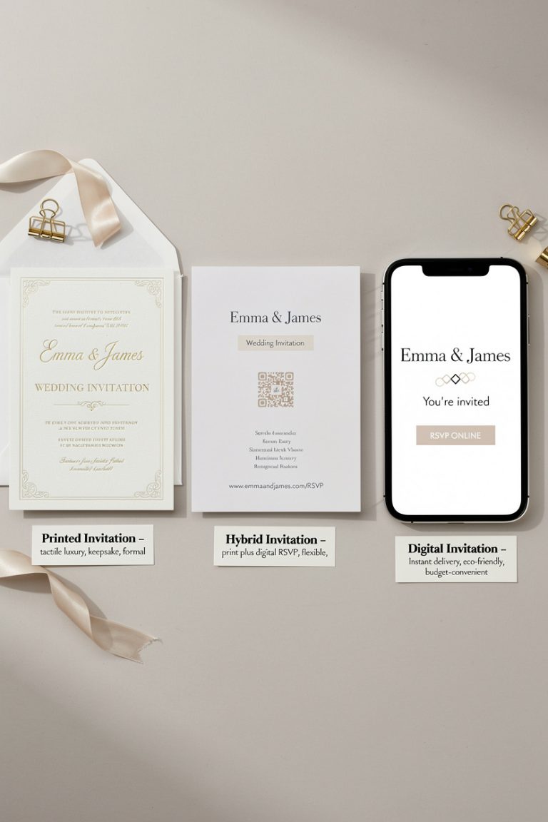
- Streamline the suite: combine details on one card, use a QR code for RSVP
- Standard sizes: avoid odd dimensions to reduce custom cutting and postage
- Simple liners or no liners: if you skip them, add a wax seal for impact
- Batch calligraphy: do outer envelopes only; print the rest
DIY, but make it chic
Order blank envelopes in a premium neutral, print your cards at a reputable shop, and add a vellum band or wax seal at home. Test print colors first—grays can shift warm or cool depending on the printer, and we don’t need surprise purple.
Common Mistakes to Avoid
Even neutrals can go sideways if you overdo it or forget key details. Here’s what to watch.
- Too many fonts: stick to two, three max
- Illegible script: if Grandma can’t read it, it’s a no
- Low-contrast ink on dark stock: use foil or white ink on deep envelopes
- Ignoring texture: flat paper + flat ink can feel bland; add one tactile element
- Postage drama: heavy suites need extra stamps—check at the post office
FAQ
Which neutral works best for a black-tie wedding?
Go with ivory or bone cards, charcoal or black ink, and a touch of gold or champagne foil.
Keep typography classic and add a blind-debossed monogram for texture. It reads formal without feeling dated.
Can I use white ink on dark envelopes?
Yes, and it looks amazing. Just make sure your printer can handle opaque white (not all can).
Pair with a light or metallic wax seal to balance the contrast—IMO it’s a power move.
Are neutrals boring for a spring wedding?
Not at all. Add soft texture (linen stock, deckle edges) and a hint of blush or sage in the liner or ribbon. The overall look stays timeless while still nodding to the season.
What information belongs on the main invitation versus inserts?
Keep the main card clean: hosts, couple’s names, date, time, venue.
Move logistics—accommodations, dress code, transportation, website—to details and RSVP cards. Your neutral layout will thank you for the breathing room.
How early should I mail neutral wedding invitations?
Aim for 8–10 weeks before the wedding, or 12+ for destination events. Send save-the-dates 6–8 months ahead so guests can plan.
Neutrals don’t expire, but your RSVP window does.
Do I need liners if I already have a wax seal?
Nope. One standout touch goes a long way. If you want both, keep the liner subtle—think solid vellum or soft marble—to avoid visual overload.
Conclusion
Classy wedding invitations in timeless neutrals give you maximum elegance with minimal stress.
They flatter every aesthetic, play well with upgrades, and never feel try-hard. Choose rich paper, thoughtful printing, and a few tailored details, and your suite will look effortlessly elevated—like you just casually have impeccable taste. Which, FYI, you do.