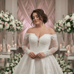
Your wedding invitation sets the tone before anyone tastes cake or sees the dance floor. The right background makes it feel intentional, elevated, and yes—totally swoon-worthy. If you want invites that look expensive without wrecking your budget, you’re in the right place.
Let’s talk backgrounds that do the heavy lifting and make your design look like you hired a fancy studio (even if you didn’t).
Why Your Background Matters More Than You Think
Your background acts like a stage for your typography and photos. It guides the eye, sets the mood, and gives the whole invite a cohesive vibe. You can go minimalist and chic or maximalist and romantic—your background makes the call. Quick tip: Use a background that supports your theme, not one that steals the spotlight.
If your background shouts, your text should whisper (and vice versa).
Classic Meets Fresh: Timeless Backgrounds That Always Work
You don’t need to reinvent the wheel. Some backgrounds deliver every single time, and they’ll still look stylish when you’re celebrating your 10-year anniversary.
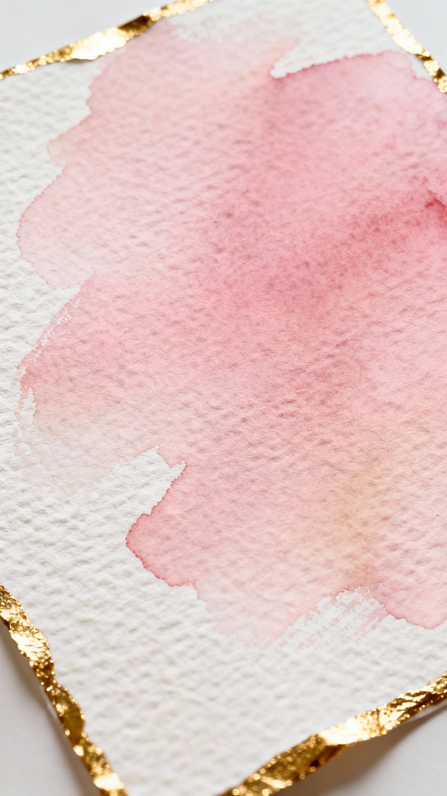
1) Soft Watercolor Washes
Dreamy? Absolutely.
Watercolor backgrounds add delicate texture and blend colors beautifully. Choose blush, sage, or dusty blue for romance, or go bolder with jewel tones for drama.
- Best for: Garden weddings, backyard celebrations, or anything floral.
- Pair with: Elegant serif fonts and subtle gold accents.
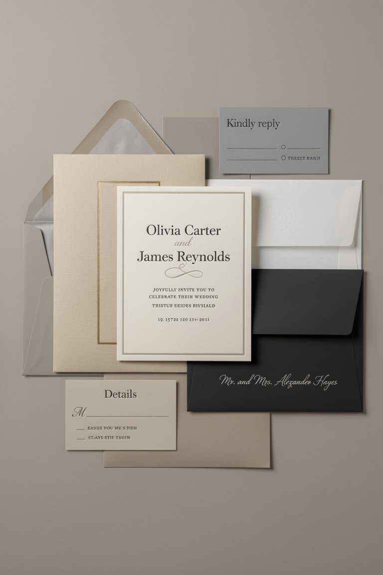
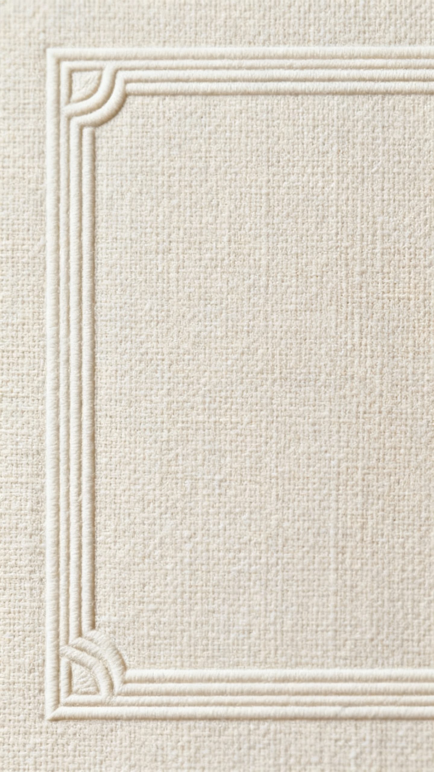
2) Minimal Linen and Paper Textures
A subtle linen or handmade paper texture screams understated luxury. It looks expensive and prints beautifully.
- Best for: Modern minimalists and “quiet luxury” vibes.
- Pair with: Clean sans-serif fonts, generous white space, and a tasteful monogram.
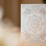
3) Botanical Illustrations
Think leafy line drawings or soft floral sprigs.
Place them in corners or along the edges so your text stays readable.
- Best for: Outdoor weddings, vineyard venues, or romantic themes.
- Pair with: Calligraphy or a serif-sans combo, muted color palette.
Modern Showstoppers: Bold Backgrounds With Personality
You want something striking? Try these looks that feel current without going full “trendy-now-regret-later.”
4) Gradient and Ombre Fades
A smooth gradient background looks sleek and on-trend. Stick to two or three colors that match your palette.
- Best for: Sleek city weddings or chic rooftop events.
- Pair with: Minimal typography, white or black text for contrast.
5) Abstract Shapes and Geo Patterns
Organic shapes and geometric forms create movement and visual interest.
Keep edges soft if you want romance, sharp if you want editorial.
- Best for: Artsy couples, gallery venues, modern lofts.
- Pair with: Bold headlines, simple body copy, and restrained color choices.
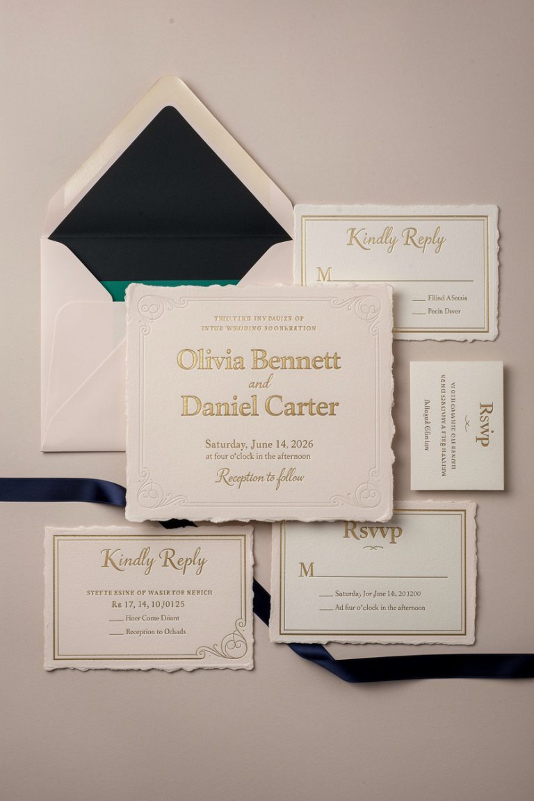
6) High-Contrast Black or Deep Jewel Tones
Black, emerald, sapphire, or merlot backgrounds look insanely luxe. Just make sure you use high-quality printing so the colors stay rich.
- Best for: Formal evening affairs, winter weddings, black tie decks.
- Pair with: Foil stamping (gold, copper, or silver) and classic typography.
Nature-Inspired Magic: Scenery That Sets the Mood
Sometimes the venue or season tells you exactly what to do. Lean in.
7) Mountain, Beach, or Forest Motifs
A subtle landscape sketch or soft photo overlay brings your location into the invite.
Don’t go full tourist brochure—keep it stylized.
- Best for: Destination weddings or couples who love the outdoors.
- Pair with: Earthy palettes, textured paper, and simple fonts.
8) Starry Night and Celestial Themes
Moody navy skies, tiny stars, a delicate moon—tell me that’s not romantic. It’s whimsical without feeling childish.
- Best for: Evening ceremonies, boho elegance, rooftop festivities.
- Pair with: Metallic inks or foil, script accents, and clean layout.

Glam It Up: Luxe Backgrounds That Pop
If your wedding has chandeliers and a signature cocktail, these backgrounds will match the vibe.
9) Subtle Metallics and Foil Elements
Not everything needs to sparkle like a disco ball. A soft metallic marbling or a foil border keeps things refined.
- Best for: Modern glam or classic luxury.
- Pair with: Deep color bases, balanced spacing, and crisp typography.
10) Marble, Onyx, and Stone
Marbleized backgrounds look elegant and editorial.
Think soft veining with lots of contrast in the text.
- Best for: Ballroom venues, chic hotels, modern classic themes.
- Pair with: Serif fonts, foil accents, and minimal copy.
Typography + Background: Make Them Play Nice

The best background means nothing if your words get lost. Typography either saves the day or ruins it. No pressure.
- Contrast first: Light text on dark backgrounds or dark text on light backgrounds.
Always.
- Hierarchy matters: Make your names the star, then date/time, then details.
- Font pairing: One decorative font + one simple font. That’s it. Don’t adopt a third stray font, IMO.
- Spacing saves clarity: Increase line spacing on textured backgrounds to keep it readable.
- Test prints: Always print a sample.
Screens lie. Printers tell the truth.
Accessibility Check (FYI, it’s important)
Ensure your text color contrasts enough with the background so every guest can read it—especially grandparents. If you go fancy with script, keep it for names or headings only.
Print Methods That Elevate Your Background
You picked a gorgeous background.
Now make it feel custom.
- Digital printing: Budget-friendly, great for photos, gradients, and watercolor.
- Letterpress: Deep impressions on thick paper. Use with minimalist backgrounds for maximum impact.
- Foil stamping: Metallic shine that stands out on dark or richly colored backgrounds.
- Spot UV: Glossy accents on a matte background—subtle and chic.
- Thermography: Raised ink for texture without the letterpress price tag.
Paper Choices That Matter
Your background prints differently depending on the stock. Choose wisely.
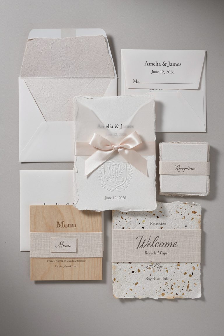
- Cotton or textured: Beautiful for letterpress and watercolors.
- Matte cardstock: Clean, modern, non-glare—great for gradients and photos.
- Pearlescent: Adds a soft shimmer; use it with minimal designs so it doesn’t overwhelm.
DIY-Friendly Tips to Nail the Look
You can absolutely design this yourself and still get that wow factor.
- Start with a palette: Choose 2-3 main colors and 1 accent.
Keep it consistent across invites, RSVP, and details card.
- Use high-res art: Minimum 300 DPI for print. Blurry backgrounds ruin the vibe faster than you can say “RSVP.”
- Mind the margins: Keep a safe zone around text—at least 0.25 inches.
- Bleed is your friend: If the background touches the edge, add a 0.125-inch bleed on all sides.
- Think in sets: Match your invite background with your envelope liner, belly band, or wax seal. Cohesion = classy.
Real-World Pairings That Just Work
Need inspo?
Steal these combos. I won’t tell.
- Blush watercolor + gold foil names + cotton paper: Ultra-romantic and timeless.
- Deep green background + white serif + copper foil accents: Luxe forest vibes.
- Soft linen texture + minimalist sans-serif + blind letterpress border: Quiet luxury, IMO.
- Navy starry sky + silver foil moon + script names: Celestial chic.
- Abstract terracotta shapes + clean black typography + matte stock: Modern and warm.
FAQ
How do I make sure my text is readable on a busy background?
Use contrast and layering. Add a semi-transparent overlay behind the text, or place text inside a clean box or frame.
Increase line spacing, and simplify fonts so they don’t fight the background.
Can I use a photo as my wedding card background?
Yes, but choose a soft, low-contrast photo. Faces or high-detail scenes distract from the text. Desaturate the image and lower brightness slightly so your typography pops.
What file format should I send to the printer?
Export a print-ready PDF with 300 DPI resolution, CMYK color, and 0.125-inch bleed.
Embed or outline fonts. If your printer wants specific settings, follow their template—every shop has quirks.
What background styles print best on a budget?
Watercolor textures, minimal linen patterns, and simple gradients look great with standard digital printing. Save foils and letterpress for your names or monogram if you want a luxe touch without the full price tag.
Should I match my background to my wedding colors exactly?
Coordinate, don’t obsess.
Aim for tonal harmony rather than perfect matches—printing can shift colors slightly. Build your palette around 1-2 core hues and let the background support them.
How do I avoid my invite looking too busy?
Pick one hero element: a bold background, a fancy script, or a shiny foil. Not all three.
Keep margins generous, reduce word count, and use consistent spacing to breathe.
Wrap-Up: Make Your Background Do the Heavy Lifting
Choose a background that tells your story, then let everything else support it. Keep contrast strong, typography clean, and print choices intentional. Do that, and your invites won’t just announce the date—they’ll set the mood, spark excitement, and look stunning on every fridge they grace.
Now go make something breathtaking.