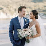
You want invitations that don’t look like they came from a generic template, right? The kind guests post on their fridge and secretly keep forever? Let’s make that happen.
We’ll mix design ideas, materials, and unexpected details so your invite screams “this party will slap.” Grab a coffee—this is the fun part of wedding planning.
Set the Tone: Theme-First Thinking
Your invites act like a movie trailer for the big day. They cue the vibe before guests check their calendars.
- Romantic garden: Think hand-painted florals, soft deckle edges, and a wax seal that looks stolen from a love letter.
- Modern minimal: Crisp typography, bold white space, and an unexpected color pop—like neon edges or a statement envelope liner.
- Destination fun: Passport-style booklets, vintage airmail stripes, or a map that doubles as wall art.
- Mood lighting: Deep hues, metallic foil, and velvet textures for an evening affair.
Pro tip
Pick 2–3 core elements—color, type, and texture—and keep them consistent across your save-the-dates, invites, and day-of paper. Cohesion = classy, IMO.
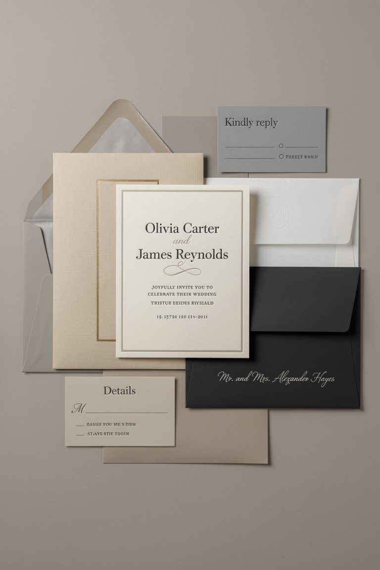
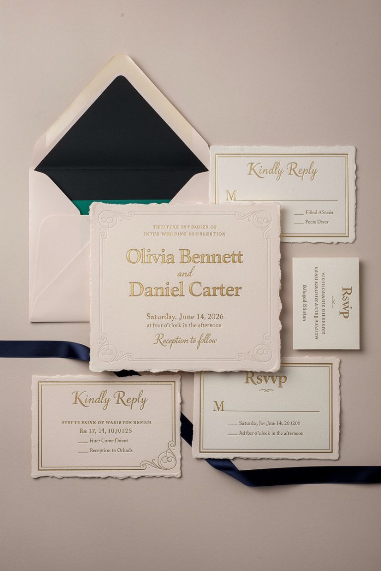
Paper That Feels Like a Moment
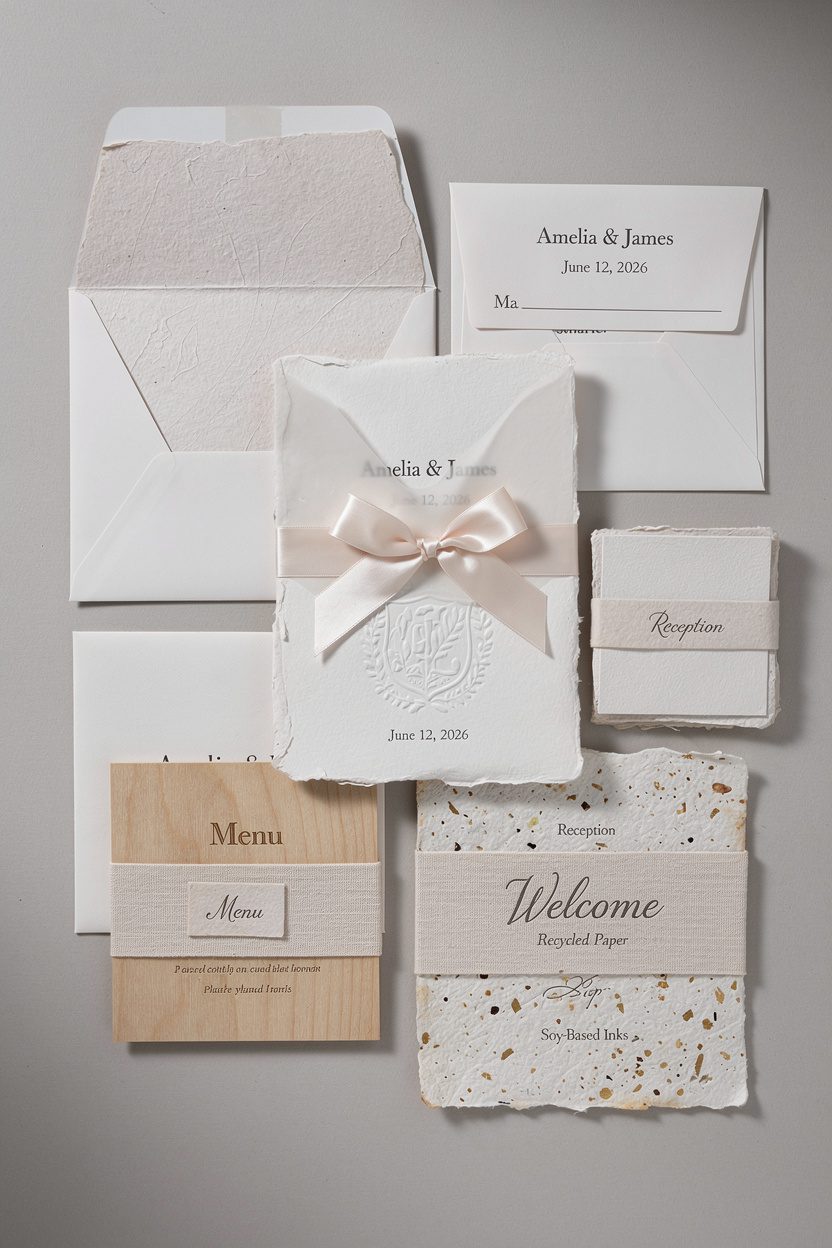
You can wow before anyone reads a single word.
How? Texture.
- Cotton rag or handmade paper: Soft, weighty, and luxe with those delicious, torn edges.
- Letterpress + deep impression: The press leaves a tactile dent—minimal text, maximum impact.
- Vellum overlays: Sheer sheets over prints or photos. Tie with silk ribbon for bonus points.
- Blind emboss: Raised designs without ink.Subtle flex, huge payoff.
- Mixed materials: Pair paper with wood veneers, acrylic, or fabric wraps. FYI: choose one “wow” material and let it shine.
Eco-friendly options
Recycled paper, seed paper you can plant, or soy-based inks look gorgeous and keep your conscience clear. Your garden will thank you later.
Typography That Talks
Good fonts tell a story.
Cheesy fonts… also tell a story, but not one you want.
- Serif + script blend: Use a clean serif for the details and a high-contrast script for names. Balance elegance with readability.
- Monospaced or geometric sans: For modern couples who love clean lines and grids.
- Oversized type: Make your names or the date the hero. Scale creates drama, no glitter needed.
Hierarchy that works
Stick to two fonts max, three sizes, and clear spacing.
If your aunt needs a magnifying glass to find the ceremony time, the font failed its job.
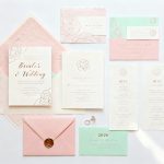
Color Palettes That Pop (Without Screaming)
Color moves emotion faster than words. Choose wisely.
- Monochrome magic: Shades of one hue—sage, olive, emerald—for a chic, cohesive look.
- Soft neutrals + one bold accent: Ivory and taupe with a punchy cobalt or terracotta edge painting. Chef’s kiss.
- Moody jewel tones: Plum, forest, and midnight with gold foil.Works beautifully for fall/winter weddings.
- Unexpected combos: Blush + rust, periwinkle + mustard, or mint + charcoal. Weird on paper, stunning IRL.
Edge details
Consider edge painting, gilded edges, or dip-dye for a quiet “wow” moment guests notice when they pick it up.
Illustration and Art That Feels Personal
Your invitation can double as art. Frame-worthy?
Absolutely.
- Custom venue sketch: Watercolor the chapel or warehouse. Guests love spotting the place before they arrive.
- Map with personality: Add icons for your first date spot or favorite taco truck. Informative and adorably extra.
- Motifs that matter: A crest with your pets, botanicals from your bouquet, or a subtle nod to your heritage.
- Photo-forward: Use a candid from your engagement.Pair with vellum or a minimal text card to keep it polished.
Where to find artists
Browse independent illustrators on Etsy or Instagram. Ask for a limited color palette and vector files for consistent print quality.
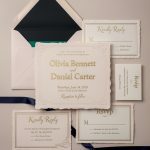
Unexpected Formats and Packaging

The envelope arrives and boom—curiosity activated.
- Accordion folds: Unfold the story: welcome note, travel info, RSVP. Feels like opening a tiny book.
- Pocket folders: Organize inserts neatly, especially for destination weddings with lots of details.
- Tag bundles: Stack small cards with a grommet or ribbon—info, RSVP, schedule—swipeable and chic.
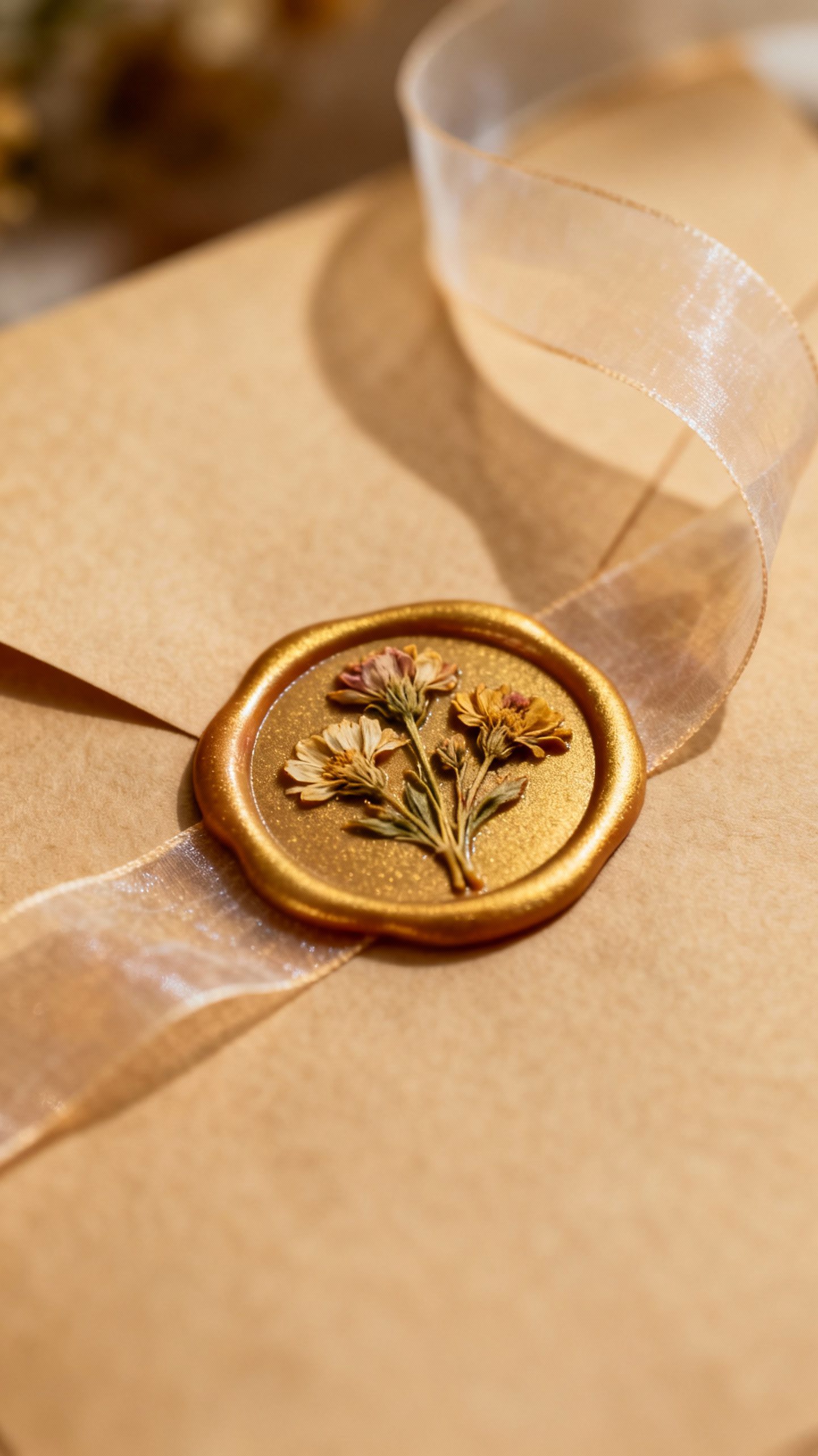
- Boxed invitations: For truly extra vibes.Add dried flowers, a silk ribbon, or a tiny keepsake.
Seals and closures
Wax seals with monograms look timeless. Try dried flower inclusions, metallic flakes, or a modern sticker seal if you prefer sleek over vintage.
Interactive Elements Guests Actually Love
Make it fun without turning your invite into a gimmick.
- QR codes (tasteful ones): Link to your wedding site, playlist, or RSVP page. Keep it small and chic.
- Scratch-off reveal: Hide the dress code or post-ceremony surprise.Adults love scratch-offs too.
- Polaroid RSVP: Include a mini photo card guests return with a note. You’ll cry reading them, fair warning.
- Pocket map + itinerary: Fold-out plans help out-of-towners feel taken care of.
Accessibility matters
Use readable font sizes, high contrast, and clear timelines. Your future self (and your grandparents) will thank you.
Etiquette Without the Eye Roll
We keep it classy and straightforward, zero fuss.
- Timing: Mail invites 8–10 weeks before the wedding (12+ for destination).Save-the-dates go out 6–8 months ahead.
- RSVP deadline: 3–4 weeks before the wedding. Give your caterer time to breathe.
- Registry: Skip listing it on the invite. Put it on the wedding website and add the URL on an insert card.
- Dress code: One clear line. “Black tie optional” or “Garden party cocktail—block heels encouraged.” Friendly, not bossy.
Budget-Savvy Splurges
You can create a premium look without torching your budget, FYI.
- Splurge strategically: Invest in letterpress or foil for the main card.Keep inserts digitally printed.
- Envelope magic: A luxe colored envelope with a liner transforms the whole suite.
- DIY with taste: Order printed cards, then add wax seals or silk ribbon yourself for that handmade vibe.
- Batch upgrades: Edge painting or duplexed paper makes a $ go far on perceived quality.
Printing 101
Ask printers for paper swatch books and proof prints. Check color accuracy, margins, and alignment. Perfection lives in the details, IMO.
FAQ
How many invitation pieces do I actually need?
Keep it simple: a main invitation, an RSVP card (with envelope or QR), and a details card.
Add a rehearsal card only if needed. Too many inserts = paper chaos.
Should we include plus-ones and kids info on the invite?
Address the envelope clearly—names listed mean invited. For kids, add a line on the details card like “Adults-only reception” or “Kids welcome at ceremony only.” Clarity beats confusion every time.
What’s the best way to collect RSVPs?
Online RSVPs work fastest and reduce errors.
Include a short URL and QR code. If you have older guests, add a traditional mail-in card too—hybrid wins.
Do I need inner and outer envelopes?
They look elegant and protect the suite, but they aren’t required. If you skip them, use a sturdy outer envelope and consider a liner for polish.
How do I avoid spelling or etiquette mistakes?
Proofread with fresh eyes, then have one grammar-obsessed friend review.
Confirm addresses and titles. Run a printed proof before the full run—always.
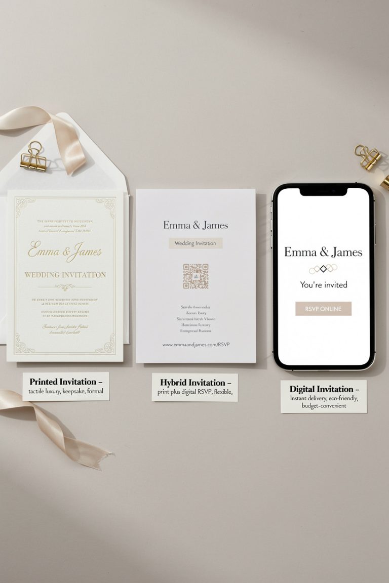
Can I mix digital and physical invitations?
Absolutely. Send physical invites to family and VIPs, and digital to friends or international guests.
Just keep the design cohesive so it still feels intentional.
Wrap It Up (With a Bow, Obviously)
Your wedding invitation should feel like a tiny preview of the magic you’re planning. Choose a clear vibe, pick a few “wow” details, and edit ruthlessly so the design breathes. If it makes you smile when you hold it, you nailed it—and your guests will feel the love before they even RSVP.