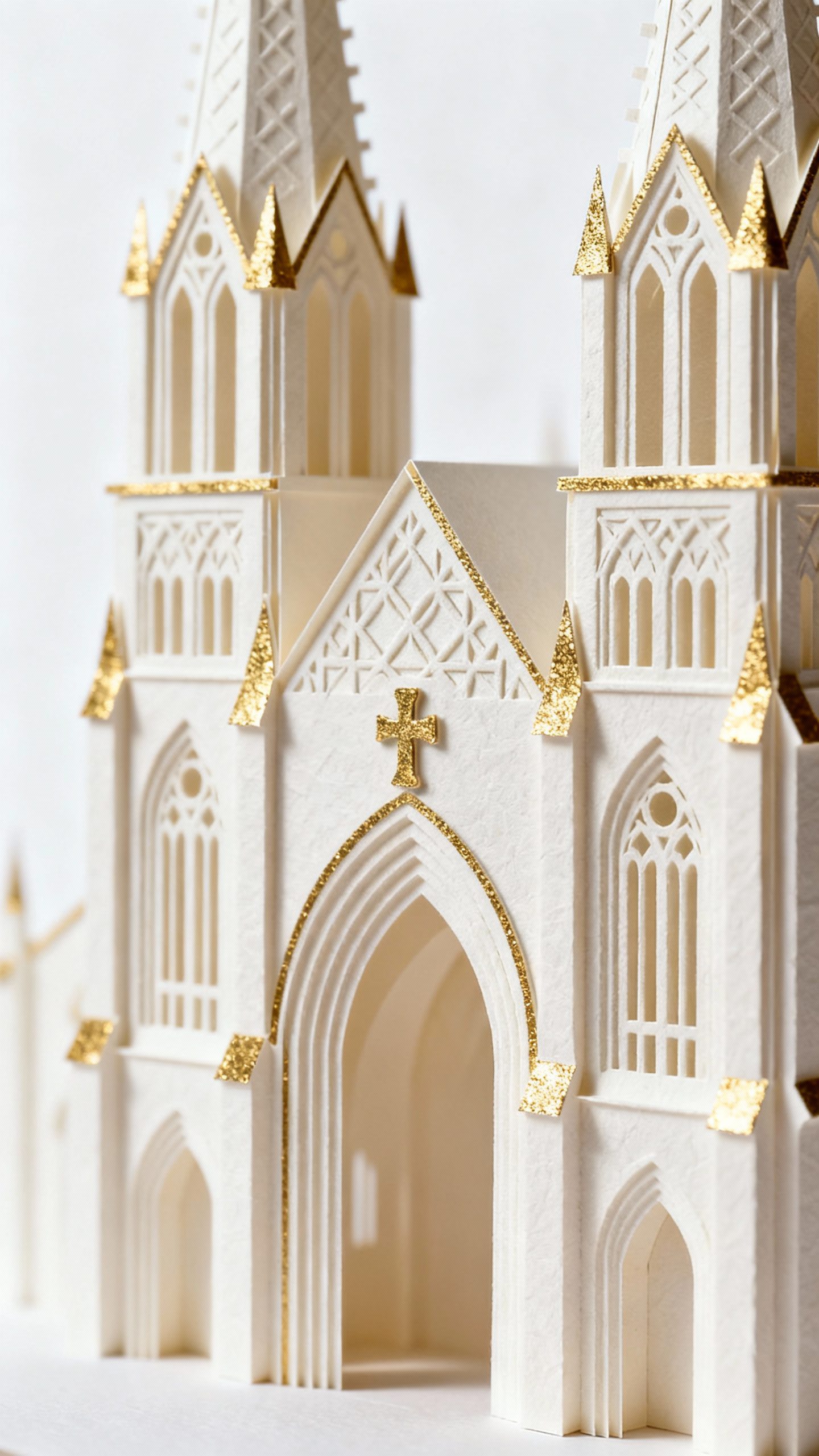
Your invitation opens and—bam—a tiny cathedral rises from the paper, kissed with a gleam of gold. You hear the collective gasp before anyone reads a single word. That’s the magic of handcrafted 3D pop-ups paired with metallic wedding stationery: it turns mail into a moment.
Ready to make your guests brag about your invite on Instagram? Let’s play with paper, light, and a little showmanship.
Why 3D Pop-ups + Metallics Make People Lose Their Minds
You send a flat card; folks nod. You send a 3D pop-up; they swoon and text you ten exclamation points.
It’s not just novelty—it’s theater. The pop-up gives depth and movement, while metallic foils add sparkle and contrast. The combo hits three big senses:
- Visual drama: Elevated shapes + reflective shimmer = instant “wow.”
- Tactile joy: Layers and cutouts invite hands to explore.
- Emotional resonance: Handcrafted details signal care and intention.
FYI, you don’t need a royal budget. You just need smart design choices and a little patience.
Design Concepts That Actually Work (And Won’t Drive You Nuts)
You want a design that opens smoothly, reads clearly, and looks intentional.
Over-ambitious concepts can turn into tiny paper tragedies, IMO.
- Architectural silhouettes: Think arches, skylines, or a chapel facade. Clean geometry pops well and looks luxe with gold foil accents.
- Floral canopies: Layered blooms with metallic linework. Keep stems simple so the mechanism doesn’t jam.
- Monogram centerpiece: A floating monogram as the 3D hero, outlined with copper or rose gold foil.
Elegant and safe.
- Storybook scene: First date landmark, a mountain range, or a city bridge. Add foil stars or water highlights for sparkle.
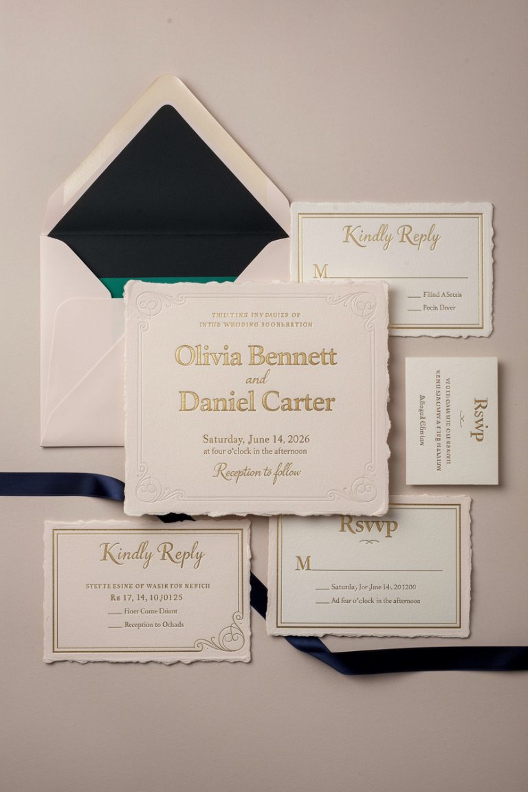
Color + Foil Pairings That Rarely Miss
- Navy + Gold: Regal without trying too hard.
- Blush + Rose Gold: Soft and romantic, never cheesy.
- Emerald + Champagne Foil: Rich, modern, a little moody.
- Charcoal + Silver: Clean, contemporary, very “gallery invite.”
Materials: The Unsexy Stuff That Keeps Everything Pretty
Let’s talk paper and foils. The right materials make your pop-up open gracefully instead of cracking like a stale croissant. Paper basics:
- Cardstock weight: 100–120 lb cover for the base; 80–100 lb for pop-up layers.
Thicker isn’t always better—too thick won’t fold cleanly.
- Grain direction: Fold with the grain to avoid cracking. Ask your printer to orient the sheet correctly.
- Finish: Uncoated or lightly textured stocks grip glue better. Smooth stocks look slick but need strong adhesive.
Metallic methods:
- Foil stamping: Crisp, shiny, and durable.
Best for text, borders, and details.
- Digital foil: More flexible for short runs; slightly less crisp but budget-friendly.
- Metallic ink: Subtle sheen, not mirror-shiny. Good for large areas without blinding glare.
Glue That Doesn’t Ruin Your Soul
- Dry adhesives: Double-sided tape or sheets—clean and precise.
- PVA glue: Use sparingly with a micro-tip. Test to avoid warping.
- Glue dots: Good for tabs, not for full panels.
Mechanics: How To Make It Pop (And Not Tear)
If you love math crafts, you’ll thrive here.
If not, you’ll still survive with templates and patience. Core mechanisms:
- V-folds: The bread-and-butter. Tabs form a V that lifts an element as the card opens. Stable, easy to align.
- Box layers: Stacked “staircases” that create depth.
Great for cityscapes and florals.
- Parallel folds: Elements slide forward as it opens—excellent for monograms and signage.
Pro tips:
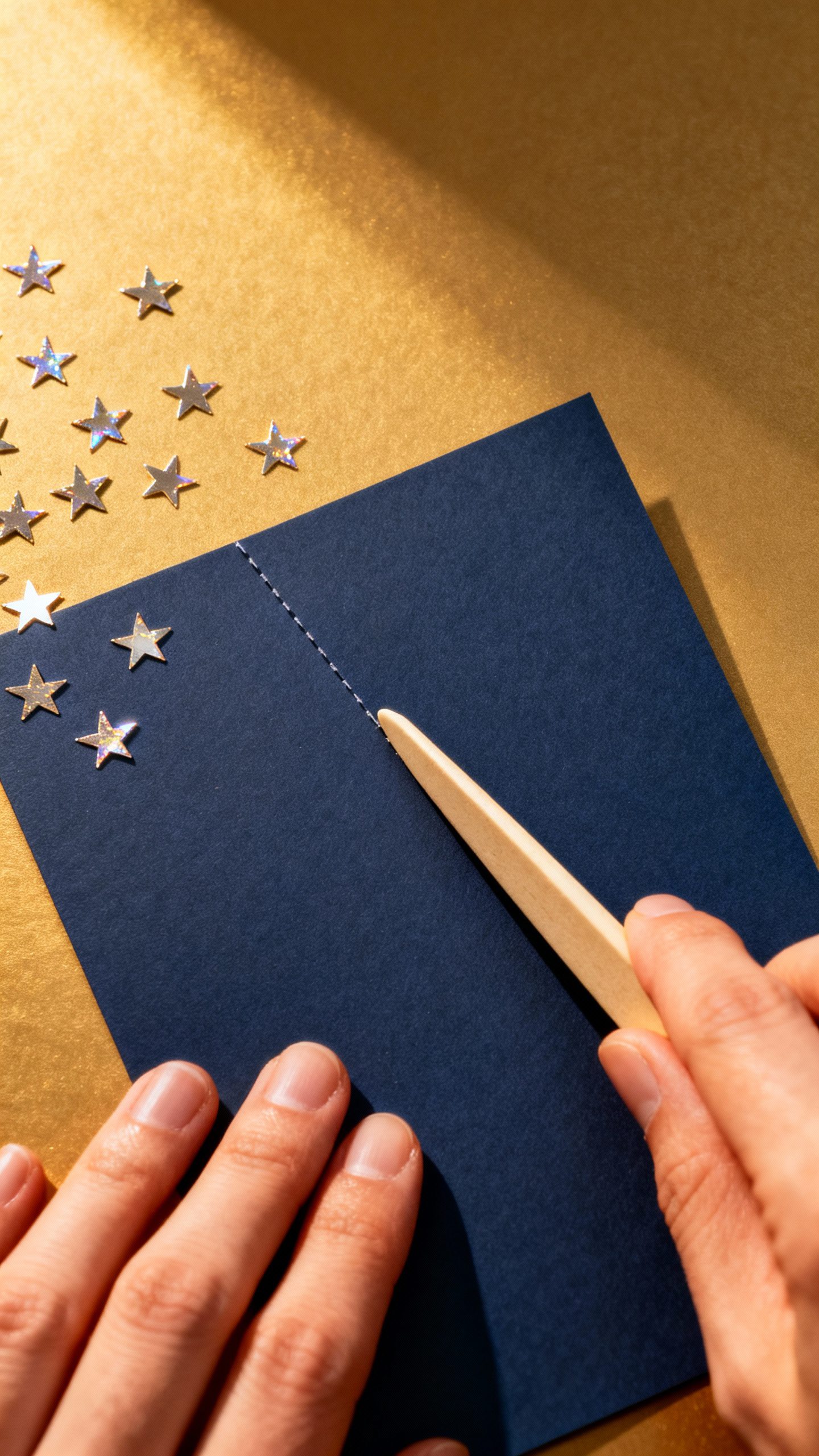
- Score every fold. Use a bone folder. Your future self will thank you.
- Test with cheap paper first.
Adjust angles and tab lengths before you touch the fancy stock.
- Keep the push-pull flat. Avoid heavy elements that torque the fold.
Metallic Placement Without Overkill
- Highlight outlines, not entire surfaces.
- Foil only the front face of raised elements to reduce friction.
- Use micro-foiled dots or stars to create depth without weight.

Workflow: From Idea to “Wow” Without Chaos
You need a plan. A little structure keeps the glitter on the paper and off your sanity.
- Sketch: Quick pencil drafts—front cover, inside spread, and the pop-up layers.
- Mock-up: Build a rough version in copy paper.
Check opening angle and sight lines.
- Digital files: Vectorize shapes. Label tabs. Plan foil layers separately.
- Proofs: Order one printed/foiled proof.
Inspect for cracking, misalignment, or foil overfill.
- Assembly: Batch process—fold all, glue all tabs, press under weight, then QC each piece.
- Mail test: Send one to yourself. Check postage, thickness, and durability.
Timing + Budget Cheats
- Lead time: 8–12 weeks from concept to mailing for handcrafted runs.
- Quantities: 50–150 is the sweet spot for semi-custom production.
- Save money: Keep foil areas small, limit colors, and use laser cutting only where necessary.
Style Ideas That Feel Fresh
Need inspo? Steal these and make them yours.
- Luminous Archway: Layered arch frames in ivory with matte gold foil outlines, small V-fold lanterns, and a vellum overlay for names.
- Botanical Garden: Three-tier greenery with sage and olive papers, copper-foiled veins, and hidden parallel folds for depth.
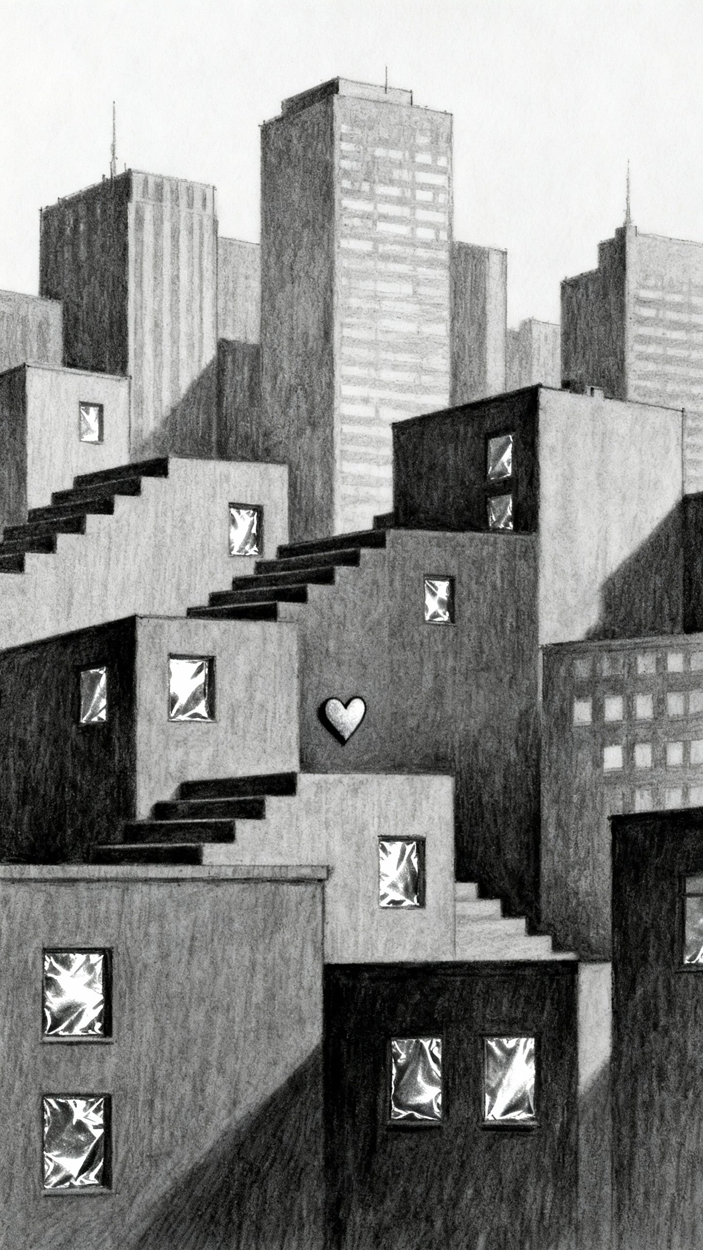
- Modern Skyline: Charcoal base, silver-foiled windows, and stair-step layers for skyline dimension.
Add a tiny foil heart where you met.
- Celestial Night: Deep navy, scattered micro-foil stars, and a rising moon disc as the pop-up. Romantic without being sugary.
Matching Suite Elements
Tie the room together with coordinated pieces:
- Foiled envelope liners and address wraps
- RSVP postcards with a mini pop element
- Wax seals with metallic flecks
- Day-of menus with a die-cut peek window
Assembly and Survival Tips (Because Glue Happens)
Keep it crisp:
- Wash hands or wear cotton gloves—foil shows smudges fast.
- Use a metal ruler and sharp blade. Change blades often.
- Press glued cards under heavy books for an hour.
Warping drops dramatically.
Quality control checklist:
- Does it open to at least 120 degrees smoothly?
- Any foil flaking on folds?
- Tabs fully adhered, no visible glue shine?
- Text legible with the pop-up deployed?
Shipping Without Heartbreak
- Use protective belly bands or tissue prevent snagging.
- Choose thicker envelopes and face the pop-up upward.
- Hand-cancel postage at the post office to minimize machine crush. Small fee, big peace of mind.
Etiquette With a Side of Extra
You’re going big—keep it gracious too.
- Clarity first: Include a simple insert with schedule, dress code, and RSVP info. Pop-ups can distract (in a good way).
- Accessibility: High-contrast text, readable fonts, and avoid micro-type.
Beauty that includes everyone = chef’s kiss.
- Eco-considerate: Choose FSC-certified stocks, soy inks, and recycle offcuts. Being fancy and responsible can coexist, IMO.
FAQ
Will a 3D pop-up invitation cost a fortune?
Not necessarily. Costs depend on complexity, foil area, and quantity.
You can keep budgets friendly by limiting the number of pop layers, using digital foil for small runs, and sticking to one or two paper colors.
Can I DIY these or do I need a pro?
You can absolutely DIY simple mechanisms with a craft cutter and patience. For intricate lace-like cuts, heavy foil coverage, or big quantities, a pro saves time and reduces waste. Hybrid approach works great: you handle assembly; a printer handles foil and cutting.
Do these require extra postage?
Usually yes.
Pop-ups add thickness and non-machinable elements. Bring a sample to your post office, get it weighed, and opt for hand-canceling. It’s a few extra dollars that protect your hard work.
What if my foil cracks at the fold?
That’s a sign of wrong paper grain, overly thick stock, or aggressive folding.
Score deeply, fold with the grain, and consider placing foil slightly away from the fold line. A softer matte foil can also crack less than some high-shine options.
How far in advance should I start?
Start design 4 months out. Approve proofs by 10–12 weeks.
Assemble and mail 8–10 weeks before the wedding (or 12+ for destination weddings). Your future self will be smug and stress-free.
Can I include QR codes without ruining the vibe?
Yes—print a small QR on a coordinating insert or foil a micro frame around it to make it look intentional. It keeps the main card clean while handling RSVPs and registry info neatly.
Conclusion
Handcrafted 3D pop-ups with metallic wedding stationery don’t just invite—they perform.
The mix of structure, shine, and story turns your first wedding touchpoint into a keepsake. Start simple, choose materials wisely, and let the light do the flexing. Your guests will open the envelope, pause, and whisper “whoa”—which, let’s be honest, is exactly the point.