Your wedding invites can do more than announce a date—they can set the vibe, start the hype, and yes, earn a spot on your guests’ walls. Think about it: why spend money on something people toss after the party? Let’s make invitations your first heirloom.
Here’s how to create wedding invitation cards so beautiful and unique that guests will frame them (and brag about them, obviously).
Design With Display in Mind
You want an invite that doubles as art. So design it like art. Think about framing sizes, composition, and how it will look on a wall, not just in an envelope.
Choose an Anchor Visual
Pick one visual theme that steals the show:
- Bespoke illustration of your venue, proposal spot, or favorite skyline
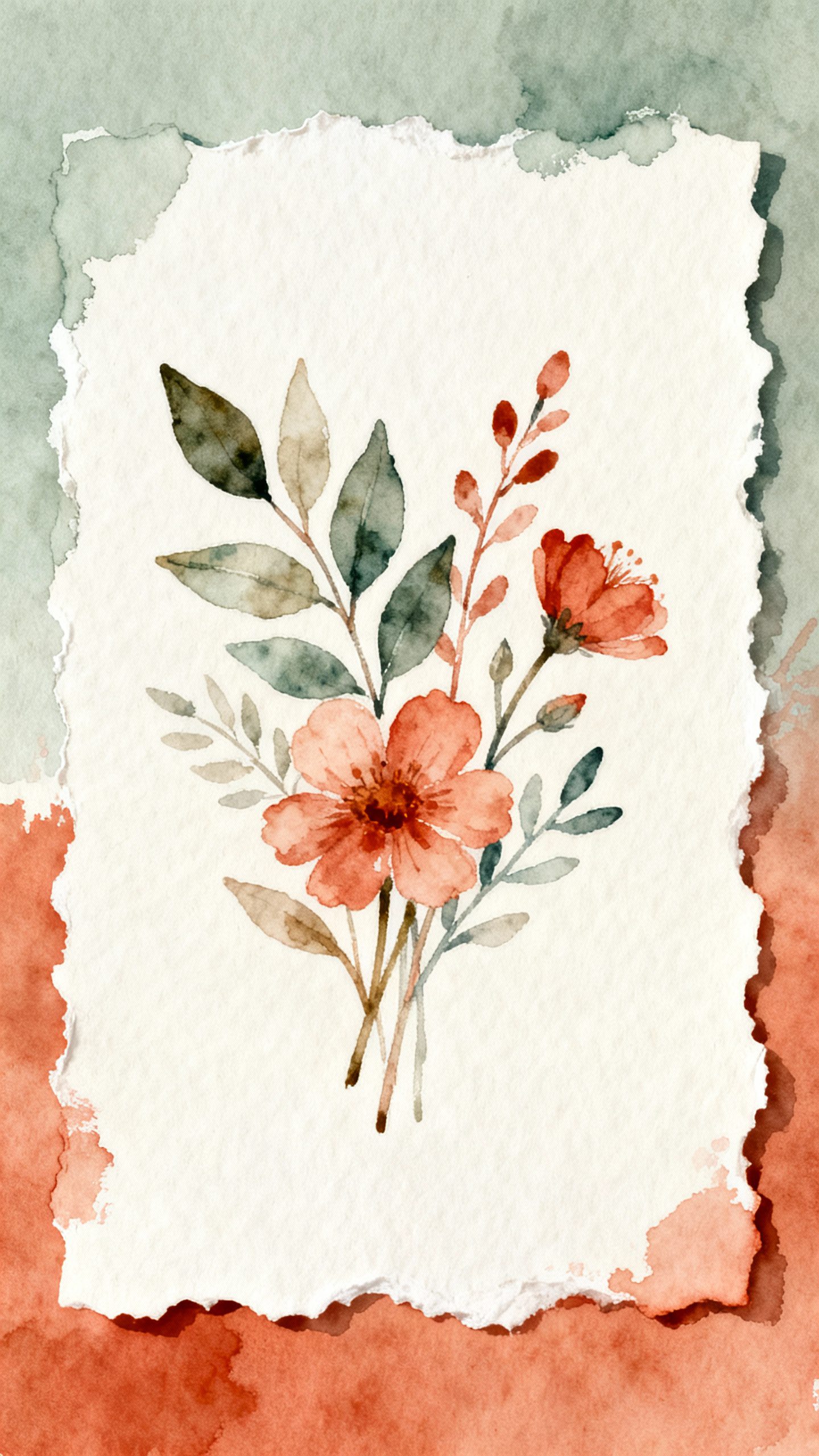
- Botanical studies drawn like vintage field guides
- Minimal line portrait of the couple—clean, chic, frame-worthy
- Art print style with bold color fields or abstract patterns
Your names and date matter, sure, but the art should lead.
You’re creating a piece someone can keep without feeling like they’re hanging a calendar.
Pick a Frame-Friendly Size
Standard sizes save headaches (and custom framing costs). Aim for:
- 5×7 inches (classic, easy to frame)
- 8×10 inches (statement, small art print energy)
- Square 7×7 inches (modern, cute, looks luxe)
FYI: Oversized invites feel dramatic but raise postage. Choose your battles.
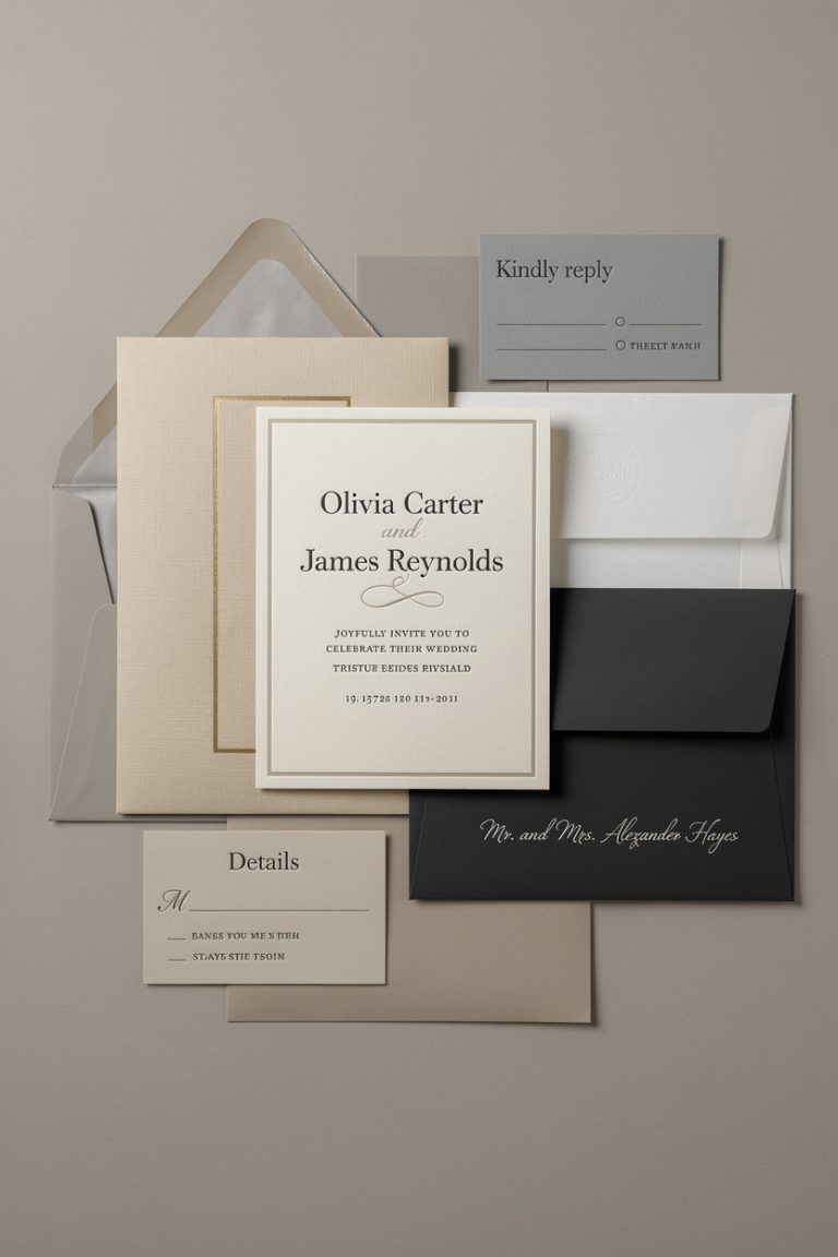
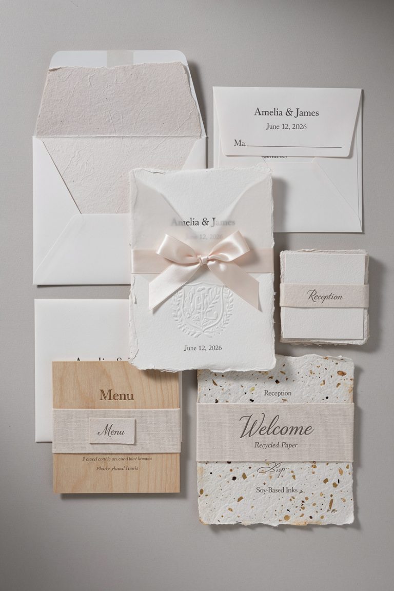
Materials That Make People Say “Whoa”
The right paper feels like a handshake—people remember it.
Go beyond flimsy stock.
Paper You’ll Want to Pet
- Cotton rag: Soft, thick, museum-y. Takes letterpress like a dream.
- Textured watercolor paper: Ideal for painterly prints and illustrations.
- Vellum overlay: Sheer layer over artwork for a reveal moment.
- Handmade deckle-edge: Feels artisanal and slightly dramatic (in a good way).
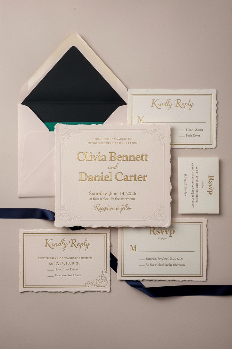
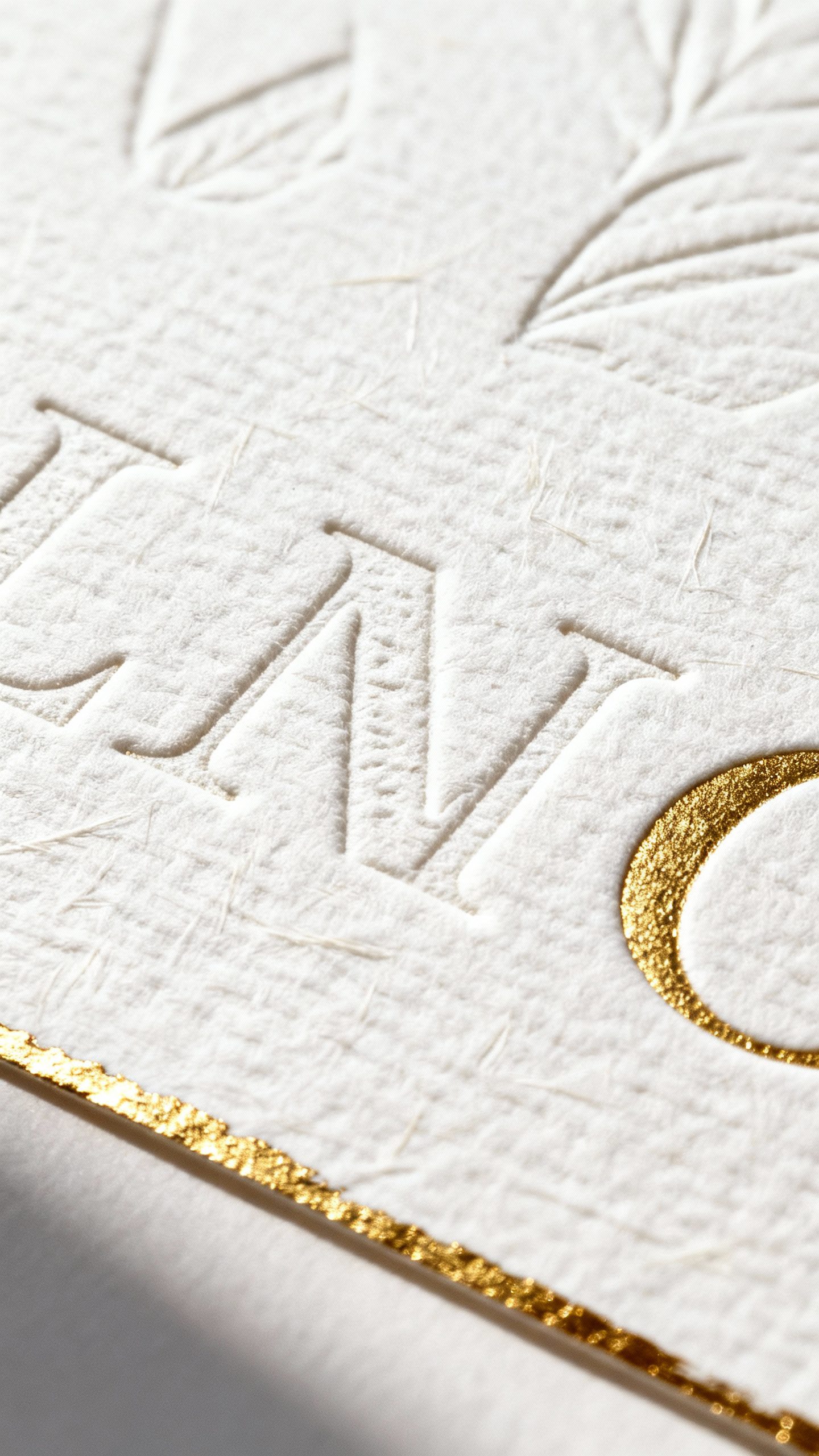
Printing Techniques That Elevate
- Letterpress: Deep impression, tactile luxury. Minimal designs shine here.
- Foil stamping: Gold, rose gold, or colored foil for names or borders—instant glam.
- Thermography: Raised ink look without the letterpress price tag.
- Riso or screen print: Artsy, bold color layers with texture and charm.
Combine techniques strategically.
Example: letterpress text + foil monogram + watercolor art print. Yes, it’s extra. Worth it.
Formats That Guests Actually Keep
You can ditch the typical flat card and do something memorable without confusing people (save the mystery for your seating chart).
The Keepsake Postcard
Design your main invite as a stylish art postcard with a detachable RSVP card.
People love postcards—they feel collectible. Just make sure the back still includes the essentials.
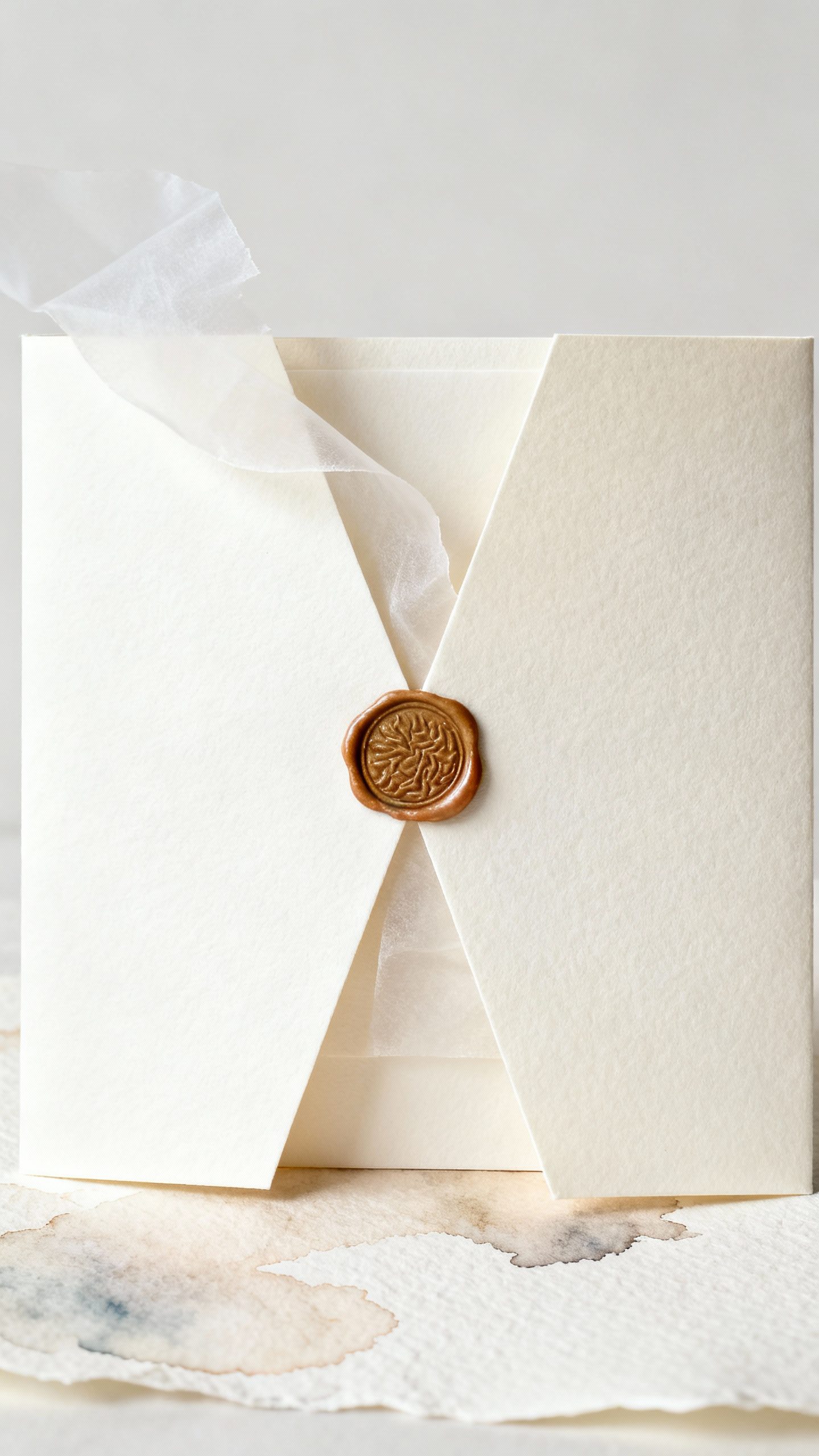
The Gatefold Reveal
Two panels open to a full illustration or engagement photo with minimal text. Add a belly band or wax seal for drama.
Your aunt will keep the wax seal forever, IMO.
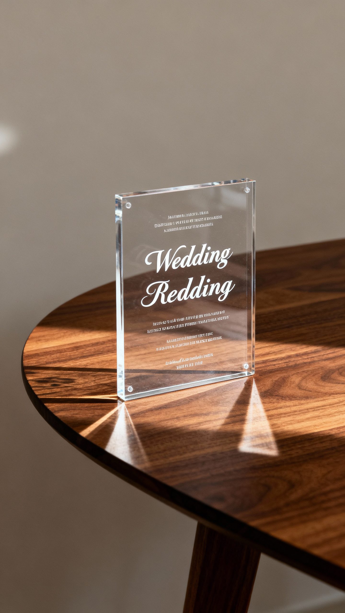
The Acrylic or Wood Invite
Clear acrylic with white ink or walnut veneer with laser-etched details looks modern and sculptural. These feel like decor immediately. Downside: shipping weight.
Upside: instant fridge art.
Tea Towel or Fabric Print
Screen print the invite on a linen tea towel or silk scarf. It’s practical and romantic. Imagine people actually using your invite in their kitchen—adorable.
Design Details That Pop (and Photograph Well)
You want your invite to feel special in hand—and look great on Instagram, because we all live there now.
- Painterly borders: Hand-painted edges or deckled edges with a colored wash.
- Custom monogram: Keep it tasteful and modern, not Victorian wedding cake.
- Blind deboss patterns: Textured elements without ink—subtle and classy.
- Metallic edge painting: Gilded edges that glint when stacked.
Tiny detail, huge flex.
- Illustrated maps: A whimsical mini-map of your venue or town. Guests love them.
Color Palettes That Age Well
Trendy colors date quickly on a wall. Try:
- Muted sage, bone, charcoal
- Terracotta, dusty rose, sand
- Indigo, cream, antique gold
Build your palette around the artwork, not the other way around.
Your future self will thank you.
Make It Personal Without Making It Cheesy
We want heart, not clip art. Add personal touches that feel intentional.
- Subtle Easter eggs: Hidden elements like your pets in the border or your favorite flower in the pattern.
- One-liner vows or lyrics: A single sentence on the back. Keep it simple and real.
- Handwriting accents: Scan your signature or a short note for authenticity.
- Date as design: Turn your date into a bold typographic moment—it’s graphic and frame-worthy.
Consider a Limited Edition
Number a small run—“Print 12/120”—like an art series.
People instantly treat it like collectible art. Yes, it’s a little extra. Also yes, it works.
Information Without the Clutter
The fastest way to ruin a gorgeous invite?
Cram every detail onto it. Separate function from art.
- Keep the main card minimal: Names, date, venue city, and a clean URL.
- Use an info card or wedding website for schedules, parking, attire, registry.
- QR code on a small insert if your crowd appreciates tech (and if it fits your vibe).
Less is more. Your guests can read details online while your invite lives out its destiny as wall decor.
Budget-Smart Ways to Make It Luxe
You don’t need to max out your credit card to impress.
Spend where it counts.
- Splurge on paper and one premium technique (letterpress or foil), keep the rest digital print.
- Design one “hero” piece (the main art invite), keep inserts simple.
- Order standard sizes to avoid custom envelopes and frames.
- DIY embellishments: Hand-tie ribbon, add a wax seal at home, or paint edges on a weekend.
IMO, texture beats gimmicks every time.
Timeline and Logistics (Because Reality Exists)
Gorgeous invites take time. Don’t let your dream design be late to its own wedding.
- 6–8 months out: Choose your designer or stationer; align on concept and budget.
- 4–5 months out: Approve final design; start production for custom printing.
- 10–12 weeks out: Assemble and mail. Earlier if international guests.
- Always order 10–20 extras: For keepsakes, frame experiments, and inevitable address updates.
Pro tip: Hand-cancel fancy envelopes at the post office to avoid machine scuffs.
Sounds fussy. It is. Worth it.
FAQ
How much should I budget for frame-worthy invitations?
For premium paper and one special print technique, expect $6–$12 per set.
Add letterpress and foil with custom art, and you’re closer to $12–$25 per set. Acrylic or wood can run $15–$40 each. You can still create artful results on a tighter budget by choosing killer paper and clean digital printing.
Do I need a designer, or can I DIY?
If you want custom illustration or complex print methods, a designer helps a ton.
But you can DIY with high-quality templates and a good printer—just focus on paper choice, typography, and breathing room. Test print before you commit.
What must be on the main invite?
Include names, date, city/venue, and a URL for details. Everything else can move to an insert or your website.
Keep the front clean so it looks great on a wall.
What colors photograph best for invitations?
Neutral bases with one bold accent photograph beautifully: cream + indigo, blush + terracotta, sage + gold. Avoid super bright neons unless you’re screen printing and going full pop-art.
How can I make my invitations feel cohesive with the wedding day?
Repeat two or three elements across touchpoints: the monogram, a motif (like a leaf or arch), and your color palette. Use them on menus, programs, and signage so everything feels intentional without being matchy-matchy.
Are unusual materials (like acrylic) difficult to mail?
They require extra padding and sometimes a rigid mailer, which bumps postage.
If you love the look but not the mailing hassle, use acrylic for a small VIP batch and paper for the rest. FYI: Hand-delivery for local friends works great.
Conclusion
Design invitations as art, and people will treat them like art. Choose a striking visual, invest in tactile materials, keep the info minimal, and add just enough personality to make it yours.
The goal? An invite that starts the celebration the moment it lands—and looks so good, your guests fight over who gets to hang it.